FactSet Agentic Platform
Designing the AI interaction model for a new, stand-alone agentic product
Role:
Principal Designer, Strategist
Platform:
New stand-alone product
Team:
4 designers, 12 developers, 6 PMs
Status:
Launched to 5,000 early adopters, expansion ongoing
• 80% workflow completion in internal testing, 20 points above the chatbot it replaced
• Beta DAU/MAU already inside the 25 to 30 target band
• Six design axioms adopted as the team's shared AI design language
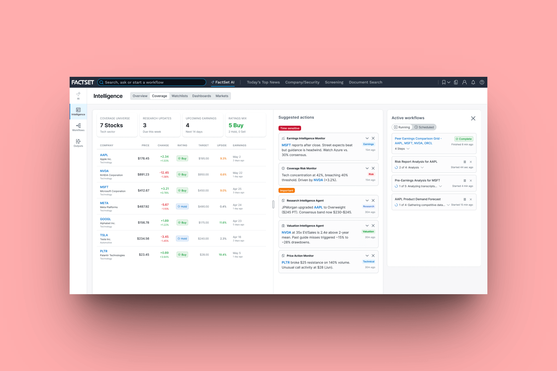
The watchlist changes surface in real time. The prompt to act on them is in-line pre-loaded with the right tickers and context
Context
FactSet has been the backbone of financial research since 1978. A single license starts at $20,000 per year. At that price, users expect the platform to work hard for them. For most of its history, it did.
Then AI-native competitors arrived. AlphaSense and a host of startups built from the ground up around artificial intelligence, offering natural language queries, smart summaries, and research synthesis that felt effortless. Large enterprise clients, including RBC, started paying attention.
Senior leadership read the room. The message was clear: get credible on AI or start losing the accounts that justify the price.
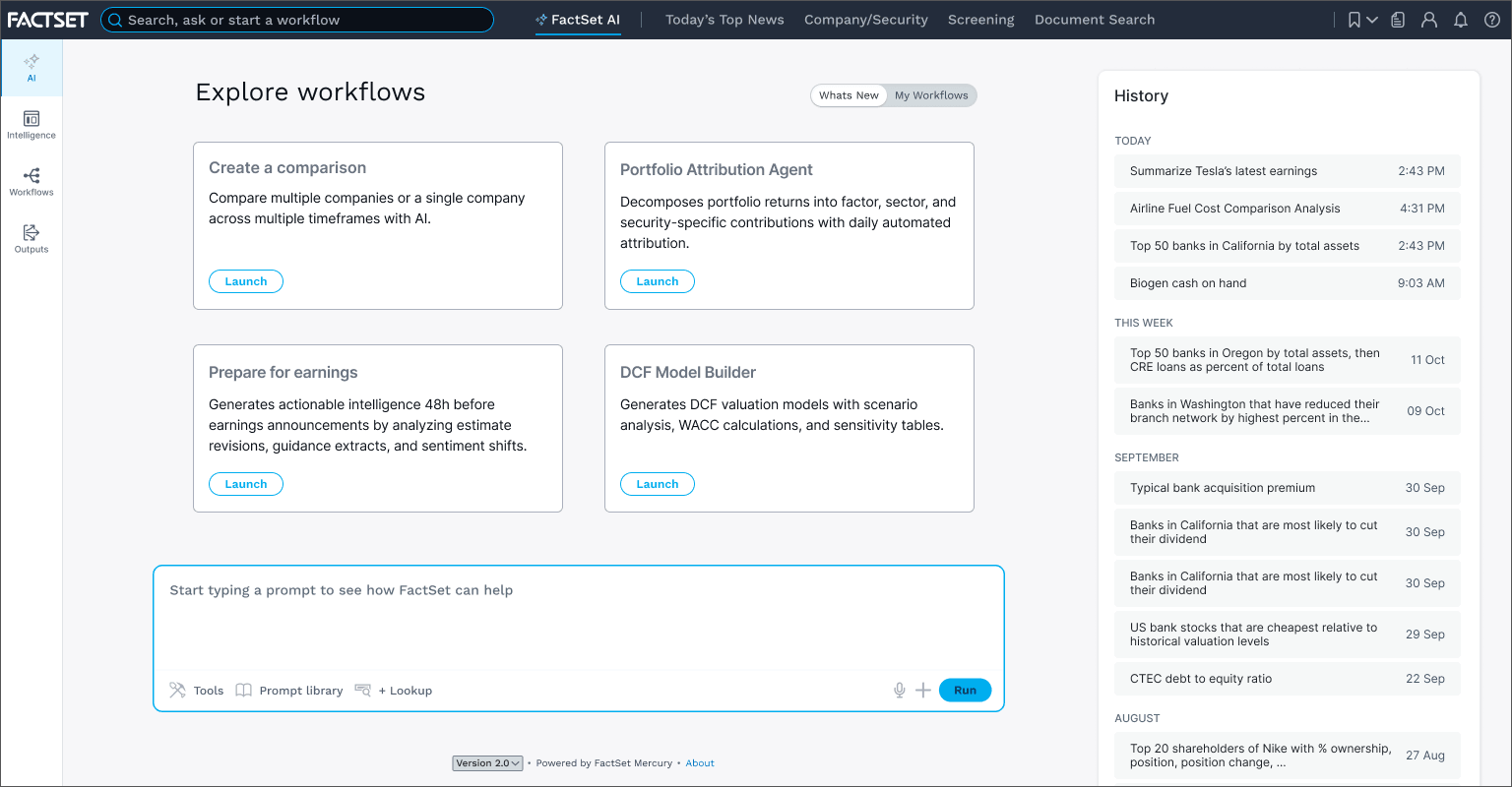
The entry point for an agentic workflow. The contextual prompt appears directly on the watchlist screen, pre-loaded with the user's tickers. One click, and this composer opens with everything already attached
Constraints
We ran two tracks simultaneously, and I owned the interaction model across both. The first embedded AI into the existing workstation so current clients could access agentic features without any disruption to their workflows. The second, and the subject of this case study, was a new, stand-alone product designed agent-first from the ground up, unburdened by thirty years of workstation conventions but expected to feel unmistakably like FactSet.
Nothing was architecturally off the table. The harder constraints were organizational. FactSet has a deeply held design value: keep everything on one screen. It made sense for years. It became the central debate of this project.
There was also a prior failure to reckon with: a chatbot that over-promised, under-delivered, and was cut. That failure shaped every interaction model decision that followed.
Targets
Metric
DAU/MAU Stickiness
Workflow Completion Rate
Prompt Modification Rate
Target
25-30%
75%+
50%+
What it proves
Habit-forming, not novelty
The UX sets correct expectations
Users are making it their own
For enterprise tools in legacy environments, 15-25% DAU/MAU is the industry baseline. Clearing 30% in a platform with entrenched workflows is a meaningful signal
Discovery
Before this project, FactSet launched a chatbot to 5,000 explorer users. It failed. The interface implied unlimited capability. The tool was constrained to FactSet's internal data. Users over-reached, got disappointed, and left. The product was cut.
That failure was the most important research finding we had. The blank box doesn't feel like freedom to an enterprise user. It feels like the tool doesn't know what it's doing.
User testing on the new concepts confirmed it. When workflows were surfaced with context already attached and a clear sense of what the output would be, users moved through them with confidence. When we put the same task inside an embedded chat widget, comprehension dropped and completion rates followed.
Our chatbot postmortem matched what Josh Clark had been describing in his Sentient Design work: "Typing prompts is not the UX of the future." The blank box promises everything and specifies nothing. It hands the user a composition problem when they came with a workflow problem. Our explorer users had told us the same thing Clark's framework predicted, they just told us with a 60% abandonment rate.
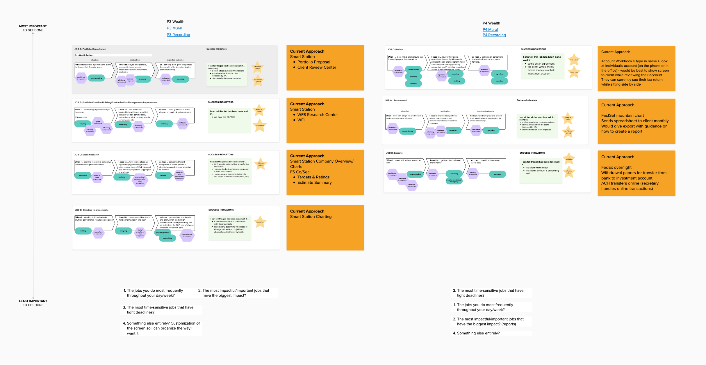
Jobs-to-be-done mapping across banking and wealth. The two user types with the most to gain from agentic workflows, and the most to lose if the prompts surface the wrong thing
An early concept video showing the AI launch view and the dashboard where users manage their agentic workflows and resources (Claude Code prototype, using Figma MCP and the FactSet native Vue design system)
Strategy
The reframe was simple: stop designing AI as a search enhancement. Start designing it as a workflow system.
Search is reactive. It puts the burden on the user to know what to ask. Workflows are intentional. The system meets users inside their existing behavior, at the moment of highest relevance, and surfaces the right prompt without asking them to go find it.
This led directly into the one screen debate. A corner chat widget doesn't preserve the workspace. It diminishes the IA as well as the AI. You can't configure a workflow, review grounded citations, and deliver a client-ready report inside 110 pixels. Trying to do so is how you repeat the chatbot mistake.
This is where my conviction about the craft did real work. I've written elsewhere that in an agentic product, the thing you're shaping isn't a screen, it's a behavior: what the agent assumes, when it checks before acting, whether it fails out loud. Every prototype in this phase was an instrument, not a deliverable. Each one asked a question about how the system should behave, and the cheap production made it possible to ask a lot of questions fast.
The argument for a dedicated composer surface wasn't about breaking FactSet's design conventions. It was that those conventions predated the role AI was being asked to take on. A workflow needs room to breathe: context attached, output format visible, citations traceable before the user commits to running it.
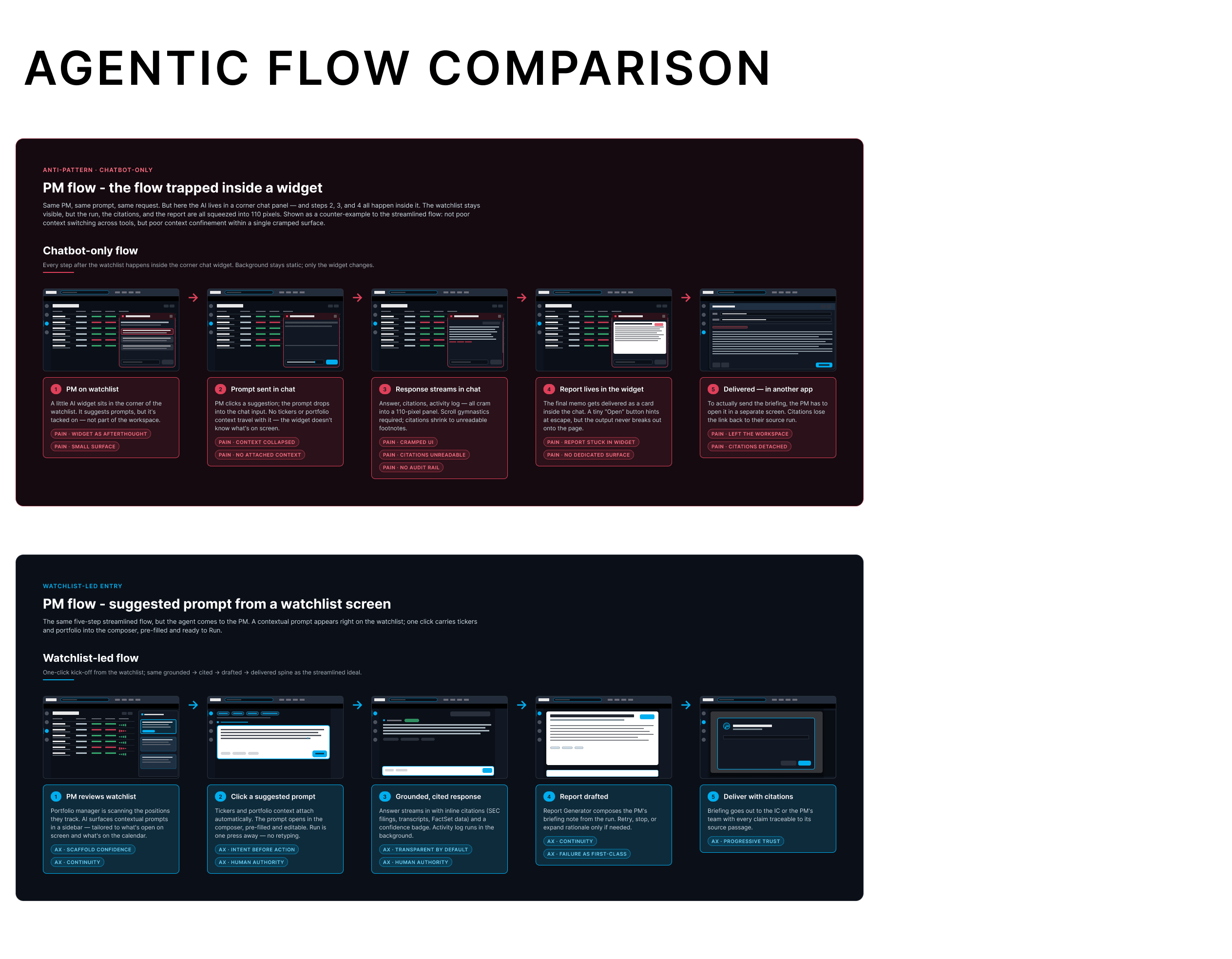
The chatbot pattern collapsed context into a small widget and left users with no sense of what the output would be. The composer surface gives the full workflow room to breathe: context attached, output format visible, citations traceable before the user commits to running it
Execution
The interaction model is built around contextual workflow prompts: large, blue-filled links that appear at natural decision points across the product. When a user searches for a company, a ticker, or an entity, these prompts surface inline, visually distinct from everything else in the system. They don't look like navigation. They signal a different class of action: this starts a workflow.
Tapping a prompt carries context forward automatically. Tickers, portfolio data, and watchlist items attach to the composer without any manual input. The AI prompt page then walks through configuration: what output format, what inputs are needed, what the user expects to get back. The system asks before it acts.
Output is delivered as a structured report. Viewable in-platform, savable to the system, optionally delivered by email. Citations are inline and traceable to source passages by default. Failure states are designed explicitly, not handled as edge cases.
Personalization runs in two phases. At launch, prompts are rule-based: specific prompts in specific contexts for specific user types. Over time, the user's search history, watchlist activity, and workflow patterns inform increasingly tailored suggestions. The platform earns relevance. It doesn't demand configuration upfront.
The prompt library ships with dozens of workflows built by PMs and engineering. Users can modify any of them to fit their clients, their preferences, their daily patterns. That modification rate, our 50% target, is the clearest signal the design is working. It means users trusted the system enough to make it their own.
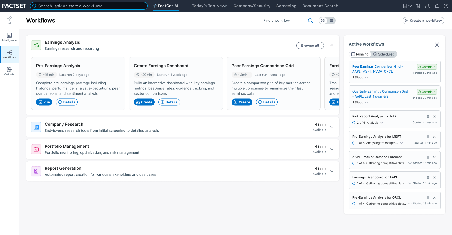
Workflow launch/examples screen. Users pick a starting point, set their parameters, and set their expectations
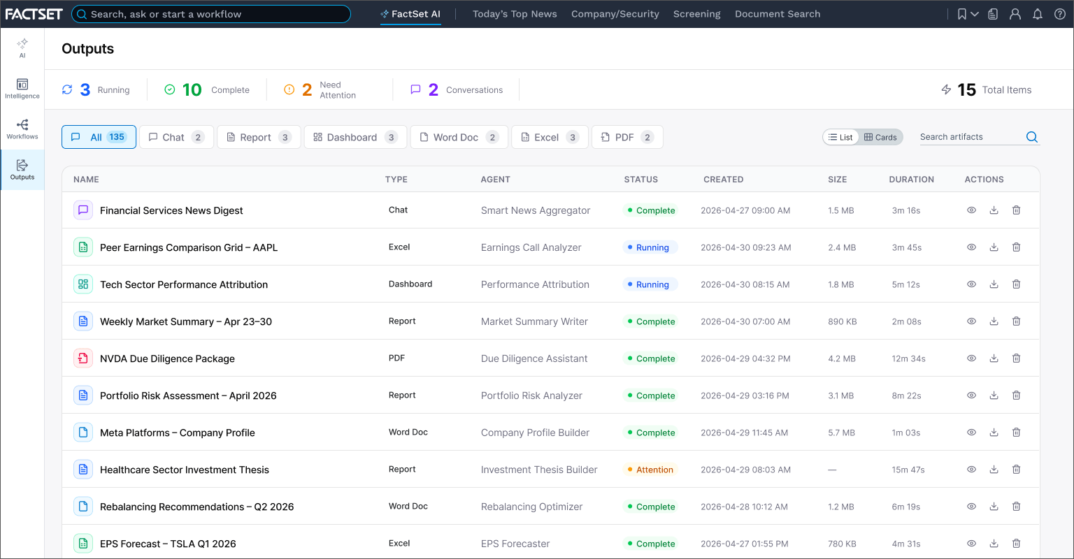
Outputs where users see a list of their cited, deliverable reports
Six design axioms came out of this work and are now the shared design language for the team. Deferential doesn't mean passive. The system suggests, cites, and asks. The user decides. In a domain where a wrong number can move real money, that ordering isn't philosophy, it's a requirement.
Scaffold Confidence - prompts appear pre-filled with relevant context
Intent Before Action - users see what will happen before it runs
Human-In-The-Loop - the user controls and approves throughout
Transparent by Default - inline citations, confidence signal on every response
Failure as First-Class - error states are designed, not ignored
Progressive Trust - every output traceable to its source passage
My specific contribution ran across four fronts: building the case for the dedicated composer surface against significant stakeholder resistance, designing the interaction model that replaced the chatbot pattern, and establishing the six axioms as the team's shared framework for every AI decision that followed. The fourth was the invisible part: designing the intelligence that arrives before anyone asks for it. I mapped the journeys agents travel before they ever surface: what they watch, what they conclude, and the moment they've earned the right to interrupt. Then I designed how predictions, insights, and options present themselves to a user who never requested them. Anticipatory AI lives or dies on that judgment call. Surface too early and it's noise. Too late and it's trivia. Too much and it's clutter. Too little and you've missed the moment.
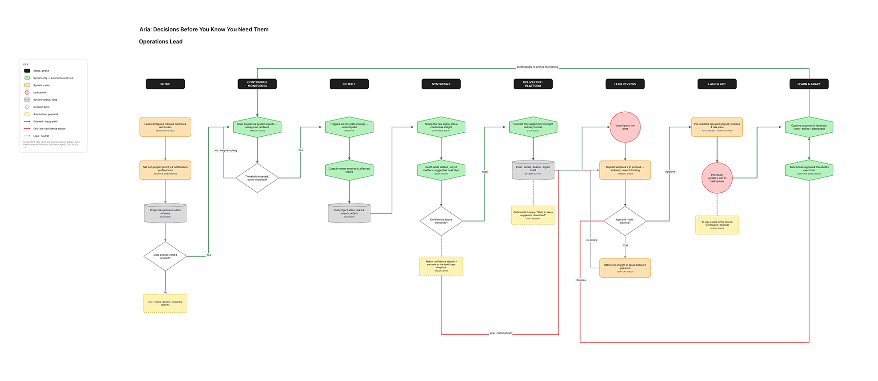
Mapping what the agent does in the dark. The hardest design decisions here never appear on screen
Outcomes
The evidence came in before launch. In user testing, the contextual prompt model beat the embedded chat widget on every measure that matters: task completion, comprehension, and drop-off. Internal testing showed an 80% workflow completion rate, 20 points higher than the chatbot experience it replaced.
In March 2026, the product launched to 5,000 early adopters: the same explorer program that had rejected the chatbot two years earlier. That audience was chosen deliberately. If the users who abandoned the blank box adopt the workflow model, the interaction thesis holds. The six axioms are locked in as the team's shared framework. The two-phase personalization model resolved the tension between predictability and relevance that the chatbot never could.
FactSet's Q2 2026 earnings narrative was built around agentic productivity as the company's primary competitive differentiator. This work is not a side project. It is the bet. Early beta reads are tracking toward the targets: workflow completion holding above 70%, prompt modification in the low 40s and climbing, and DAU/MAU among beta users inside the 25 to 30 target band. Beta cohorts skew toward early adopters, so I read these as ceiling signals rather than forecasts. Still, the early signal matches what the user testing predicted.
The launch is now being measured against the targets: 25-30% DAU/MAU stickiness, 75%+ workflow completion, 50%+ prompt modification. Each number answers a different question. Is it habit-forming? Does the UX set correct expectations? Are users making it their own? The early cohort is answering them now.
Selected Works
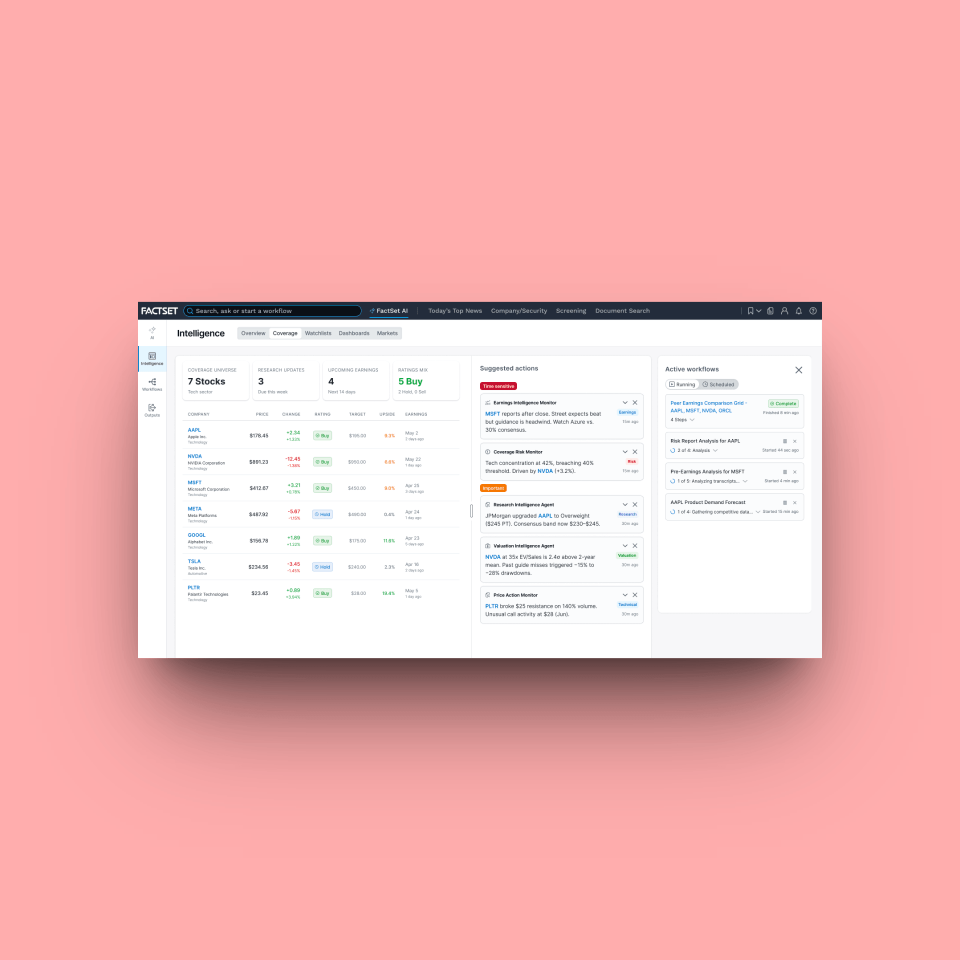
FactSet Agentic PlatformProject type
FactSet MobileProject type
FactSet PlatformProject type
Maple Row Farm AppProject type
FactSet OnboardingProject type