FactSet Platform
Rebuilding a 430-app enterprise platform at scale
Role:
Principal Designer, Strategist
Timeline:
2021- Present
Team:
5 designers, 12 developers, 6 PMs
Company:
FactSet
• NPS climbed 28 points, from 20 to 48
• Help tickets dropped 60%
• Search usage grew 200%
The platform was comprehensive enough to justify a $20,000 license and broken enough that users were Googling instead. Both things were true at the same time.
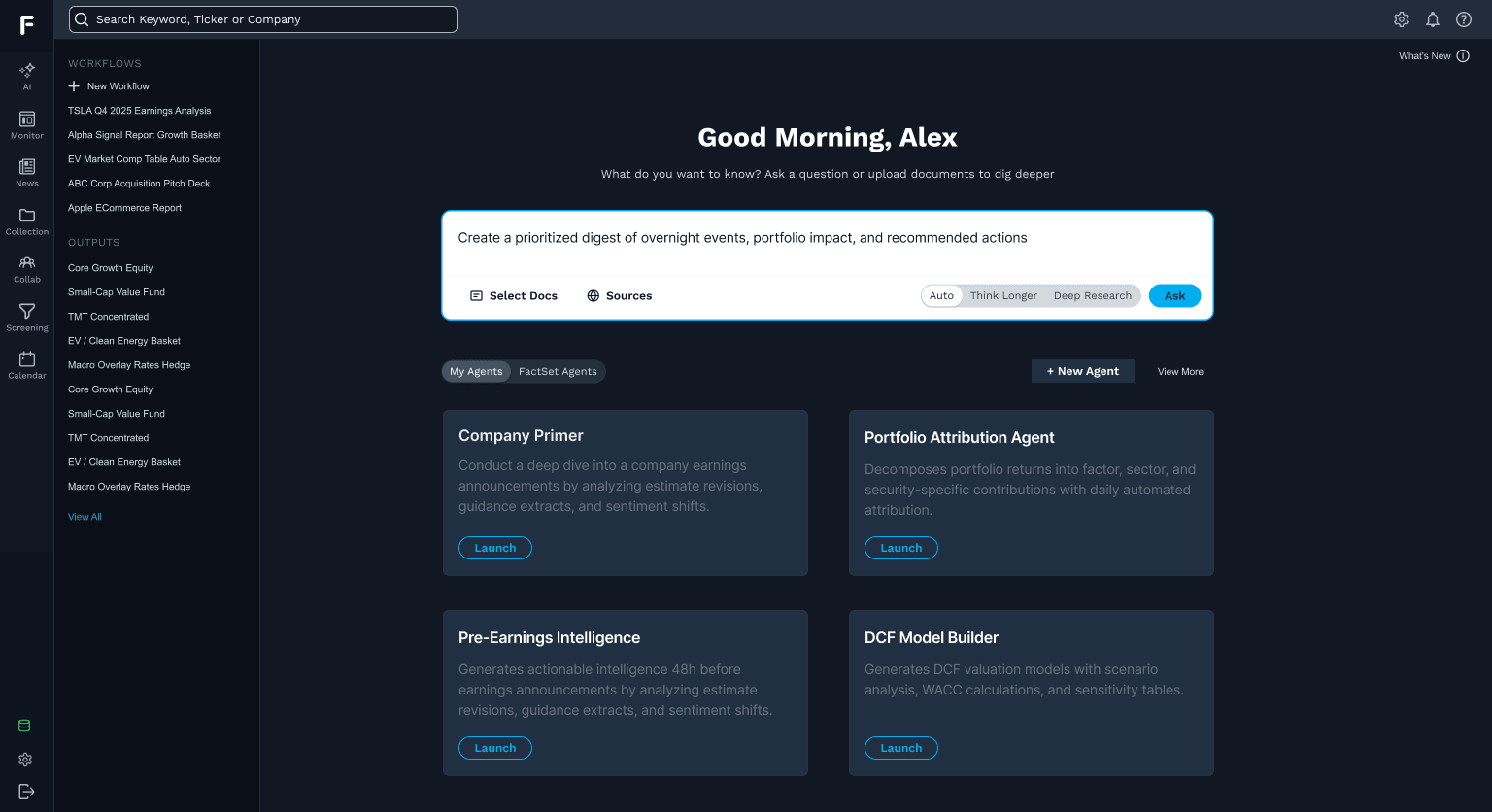
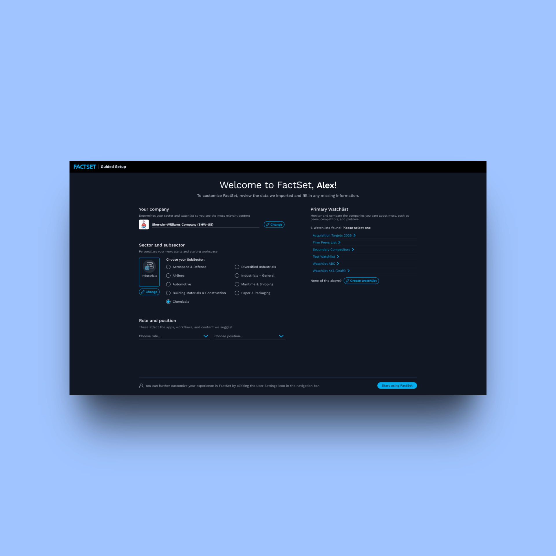
The entry point for an agentic workflow, orienting users before the handoff without requiring them to understand what's happening under the hood
Context
FactSet has been in the financial data business since 1978. Over four decades it built one of the most comprehensive platforms in the industry: a web-based SaaS product housing over 430 specialized apps serving wealth managers, portfolio managers, research analysts, and other financial professionals across six distinct user types. A single license starts at $20,000 per year, with more than 70,000 active users at the time of this project.
That scale is both the context and the constraint. A platform this large, this entrenched, and this revenue-critical cannot be redesigned carelessly. Financial professionals are particular about their software and they're vocal when something changes that they don't like. Every decision carries organizational, financial, and reputational weight.
I was the lead designer and strategist for the platform team, hands-on across the layer that holds everything together: search, navigation, settings, help systems, alerts, and the app catalog. I also set the design direction the rest of the team built against.
This case study covers the platform itself. The stand-alone agentic product that grew out of this foundation has its own case study.
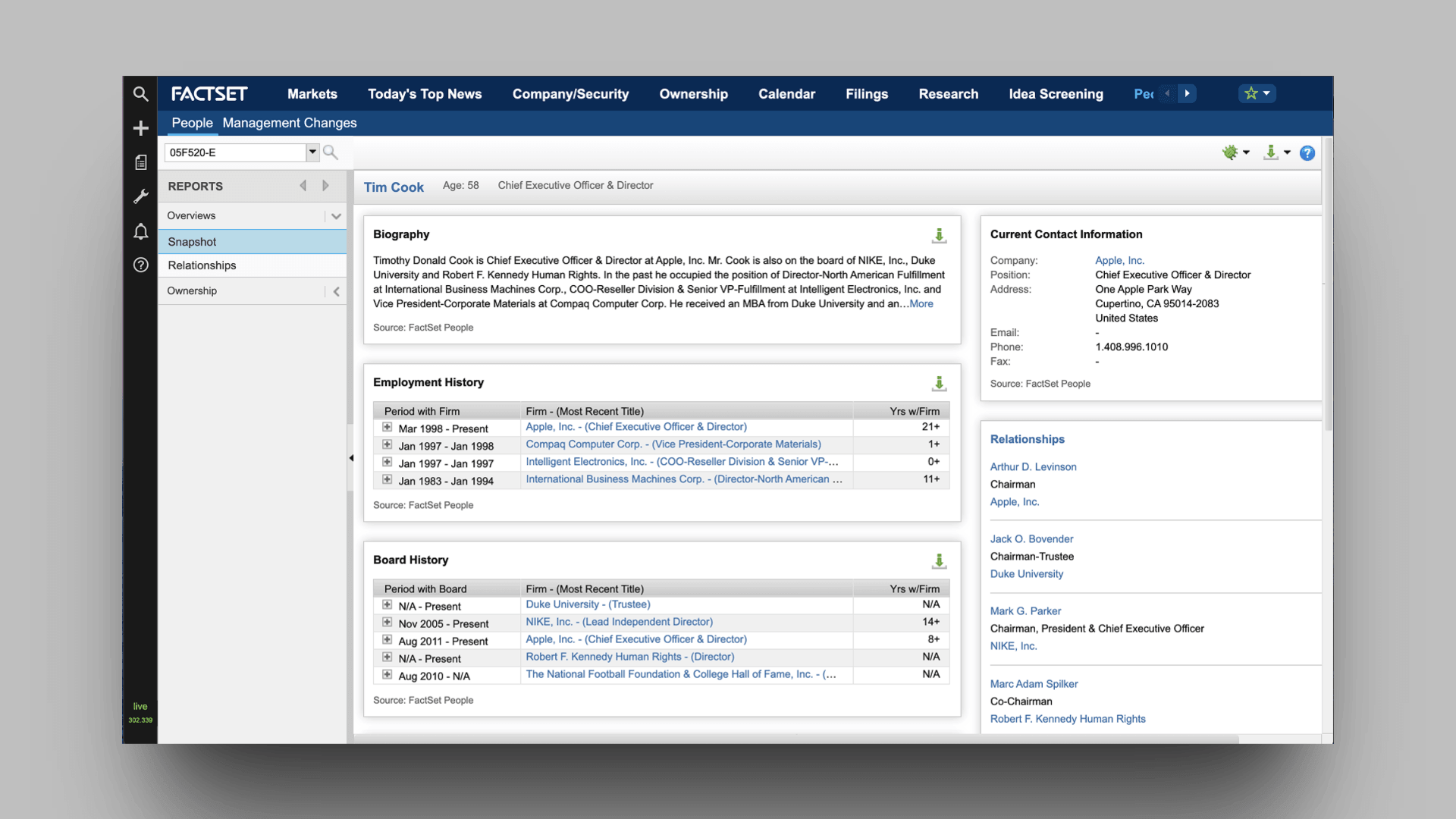
The legacy platform experience before this work began. Navigation was global and undifferentiated, exposing all 430 apps equally regardless of user role
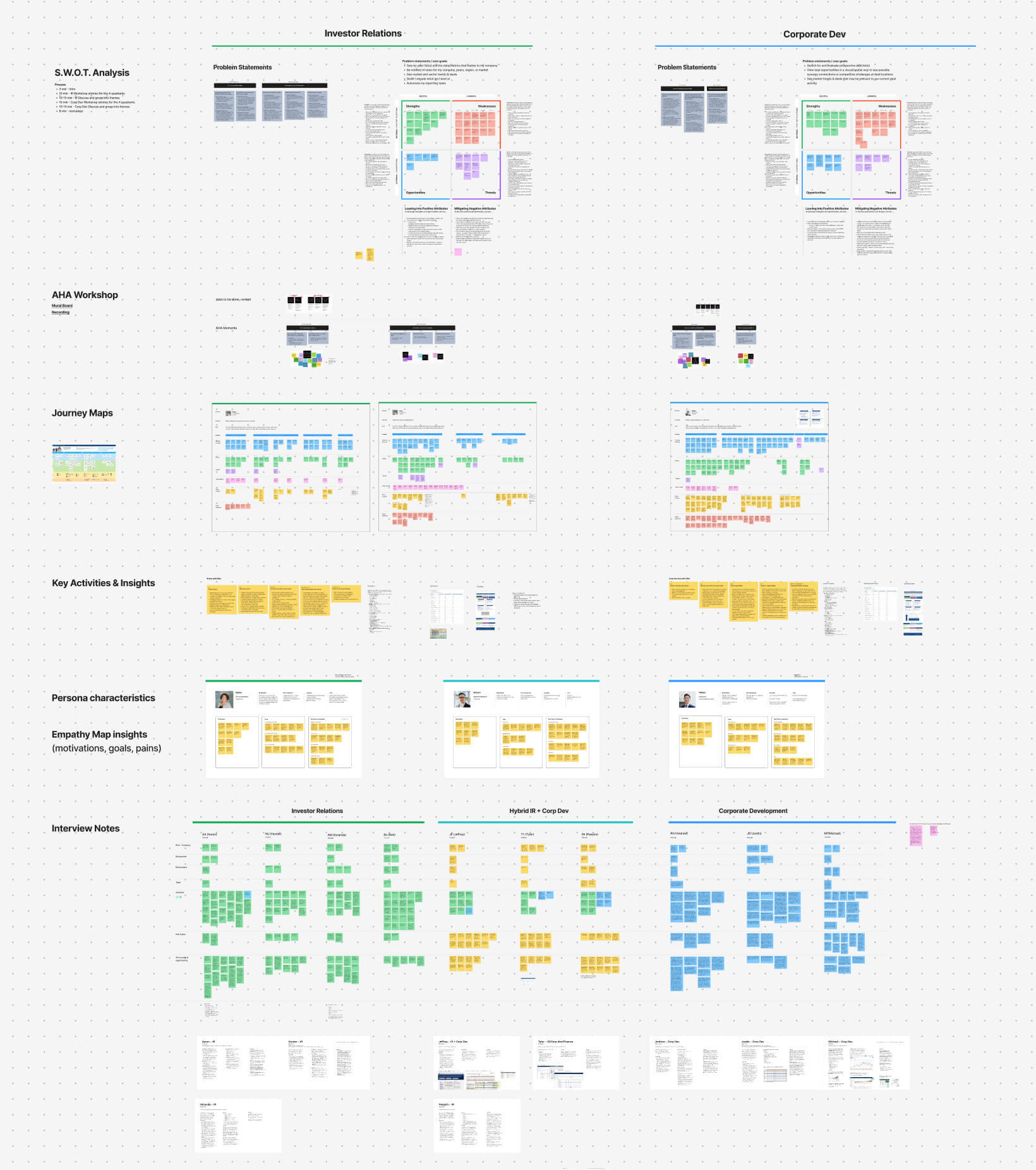
Persona development work spanning SWOT analysis, jobs to be done, journey mapping, key activities and insights, user testing analysis, and empathy mapping across a subset of the six primary user types
Constraints
All 430 apps on the platform are built by independent dev teams. Some had idiosyncratic UX patterns and sense of ownership. The platform team had no direct control over most of the apps, we controlled the shell around them, and whatever we built had to keep every app working without disruption.
WCAG AA accessibility compliance was non-negotiable. Organizational resistance came from every direction: product leadership, app team owners, engineering teams still working in legacy code bases, and the occasional executive comfortable with the status quo. Evidence alone was never enough. Every major decision required sustained advocacy.
And in the background, a new generation of AI-native startups were carving off focused financial workflows. The incumbent advantage was real, but not permanent.
Discovery
We ran continuous research throughout, tracking NPS with close attention to detractors, collecting behavioral metrics, and running qualitative studies. I led the synthesis that turned it into direction. One theme came back repeatedly, almost verbatim across user types:
"I know it's here,
I just can't find it."
-JP Morgan user
FactSet's comprehensiveness, the very thing that justifies its $20,000 annual license, had become a liability. The breadth of the platform was overwhelming its own discoverability. Users knew the information existed. They just couldn't find the path to it.
Search was one of the most powerful tools on the platform and one of the most underused. It was buried deeply enough that most users weren't reaching it. They frequently reported that rather than search on FactSet, they'd use Google instead. That single finding reframed the entire problem. This was not a feature gap. It was a structural failure of wayfinding at platform scale.

User survey data identifying highest-impact modules across user types, used to prioritize which features to raise in prominence and which structural failures to address first
Persistent global search, went from "I know it's here somewhere" to an agent that finds the answer or creates a workflow tailored specifically for you (Claude Code prototype)
Strategy
After synthesizing research across all six user types, one pattern dominated: users weren't failing because features were missing, they were failing because the platform's structure obscured what already existed. I mapped qualitative findings against behavioral data to find where comprehensiveness was working against discoverability, then used my favorite effort vs impact framework to sequence which structural failures to address first. That ultimately drove our two-track approach.
The first track was continuous incremental improvements to the live platform, shipping high-impact, lower-risk changes steadily with minimal disruption to its 70,000 active users.
The second was a new platform experience tailored by user type. Rather than exposing all 430 apps to everyone equally, I shaped six distinct experiences, each surfacing the apps and workflows most relevant to that user's role by default, reducing the cognitive load of navigating a system most users only partially needed.
Agentic AI ran across both tracks. Rather than treating it as a standalone feature, we used it to rethink how existing financial workflows could be completed, building agents that linked apps together, surfaced relevant data in new formats, and acted on a user's behalf. The north star: a platform that brings the right information to each user instead of asking them to go find it.
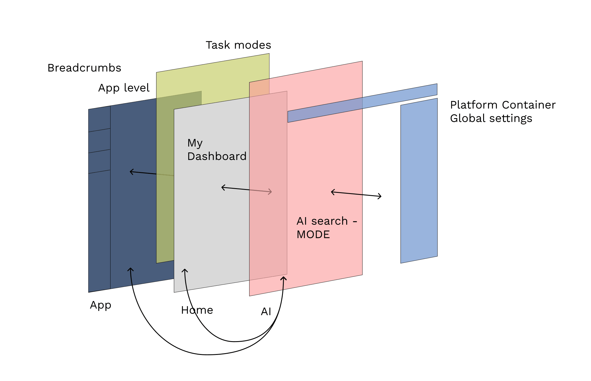
An early schematic showing how we initially viewed the AI layer in the Platform
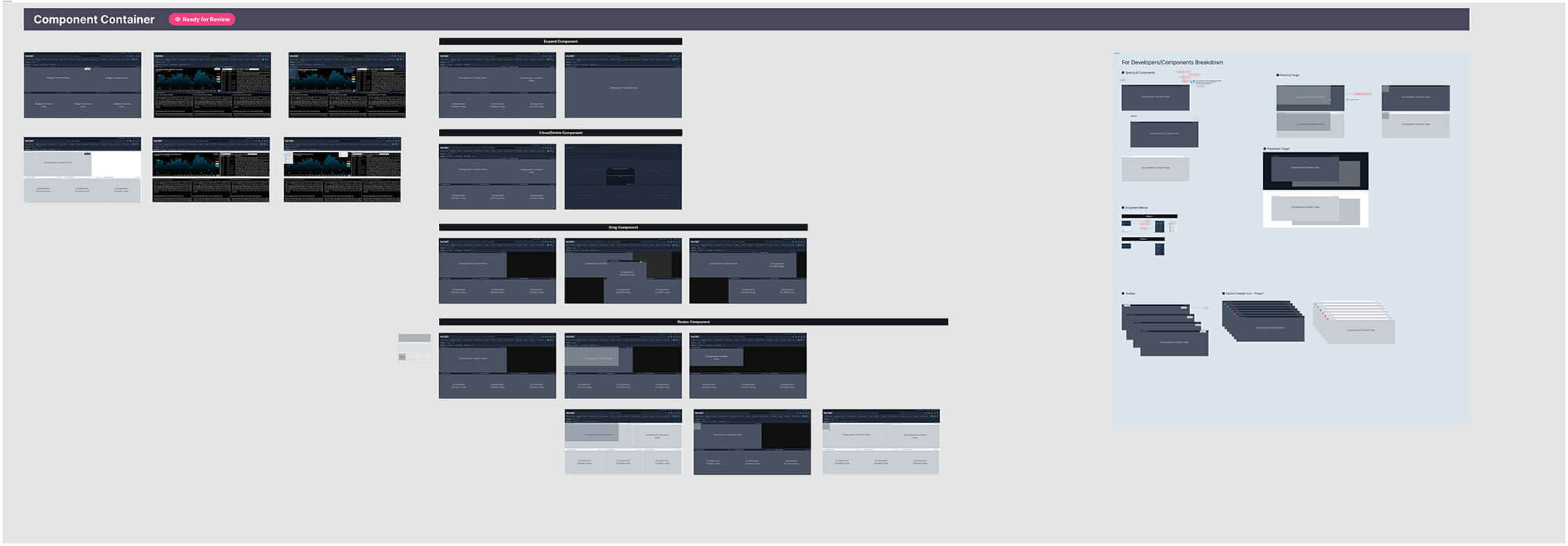
The component logic behind snap-to-lock behavior when users edit and arrange their layout
Execution
The first and most contested decision was making search permanently visible. It sounds simple but it wasn't. Product leadership, app team owners, and executives all pushed back. I drove alignment through user research, working prototypes, and A/B tests that made the cost of inaction impossible to ignore. When it shipped, search utilization grew 200%. That number became the strongest argument for every contested decision that followed. Underneath the headline number, weekly unique search users roughly doubled, and zero-result searches fell by about a third as people found apps and data they had previously given up on.
The help system was rebuilt with the same wayfinding logic we applied elsewhere. If users couldn't find answers independently, that was both a UX failure and a direct operational cost. As a result of this work, help tickets dropped 60%. In usability testing, median time to find an answer fell from over three minutes to under 70 seconds.
The app catalog moved from a flat library to a role-aware system surfacing the right tools for each user type by default. Alerts were redesigned to surface relevant news and earnings based on each user's watchlist and behavioral signals. Click-through on the redesigned alerts roughly doubled once they keyed off each user's watchlist instead of generic market events. Settings were reorganized so users could actually find and control their preferences, cutting median time to complete a settings task by 58% in usability testing.
Navigation restructuring is the most organizationally complex piece and it's still a work in progress. It touches every user type, every app team, and every executive stakeholder simultaneously, and has required the same evidence-driven advocacy used everywhere else, just at a higher degree of difficulty.
We started by treating AI as one capability among many. That has since changed. My specific contribution was making the case internally that agentic AI had to be designed into the platform's core structure rather than bolted on, then building the journey maps and interaction patterns to show what that meant in practice. The north star is a platform that works for the user, not one the user has to learn to work through.
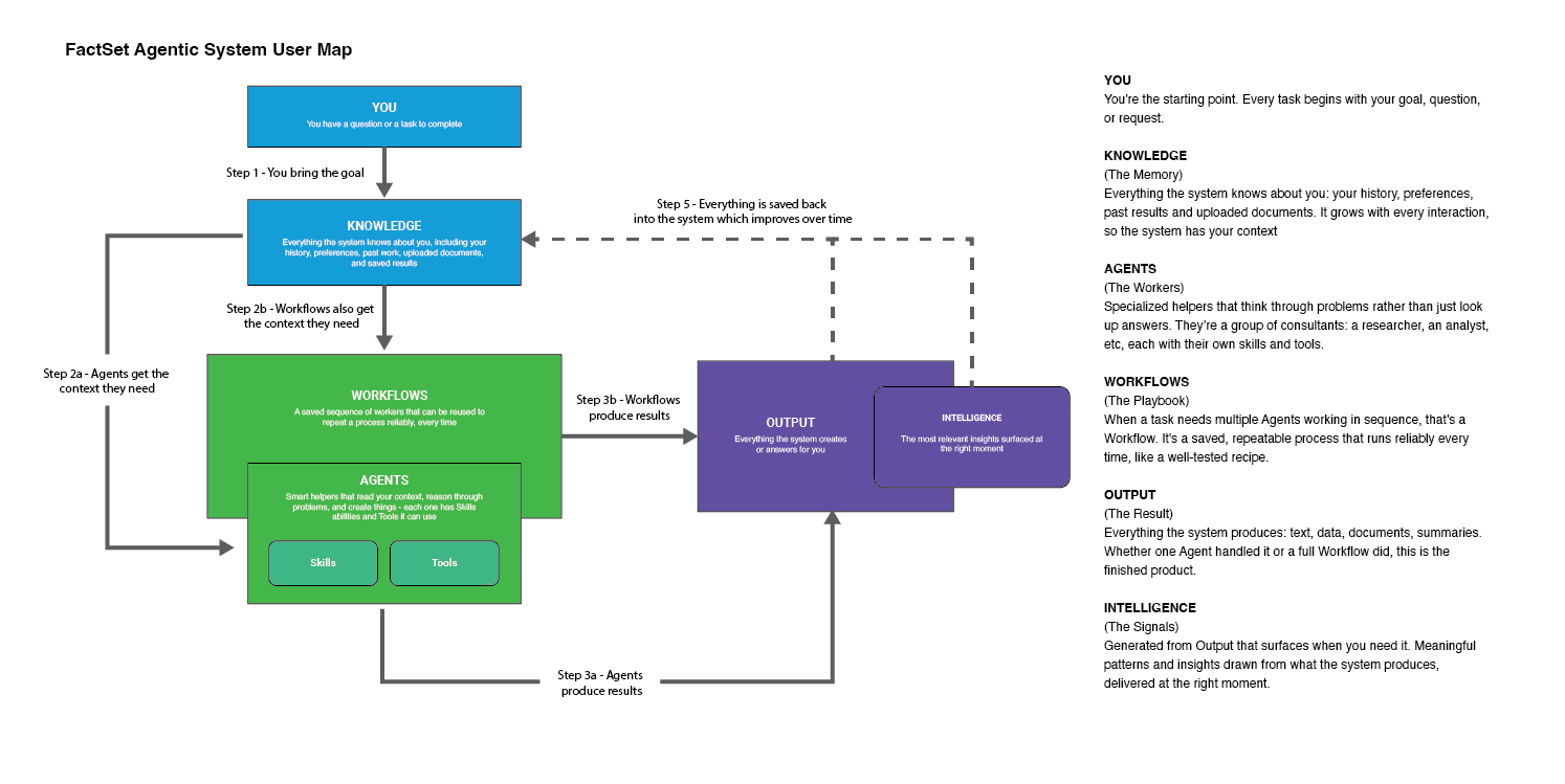
An early agentic ontology workflow map for a research analyst use case
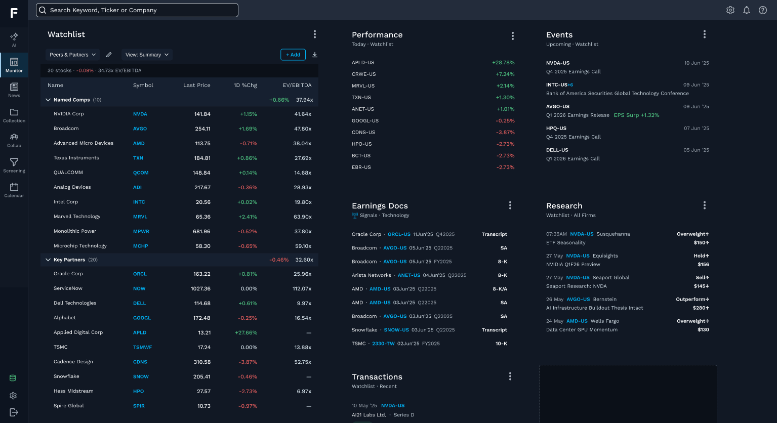
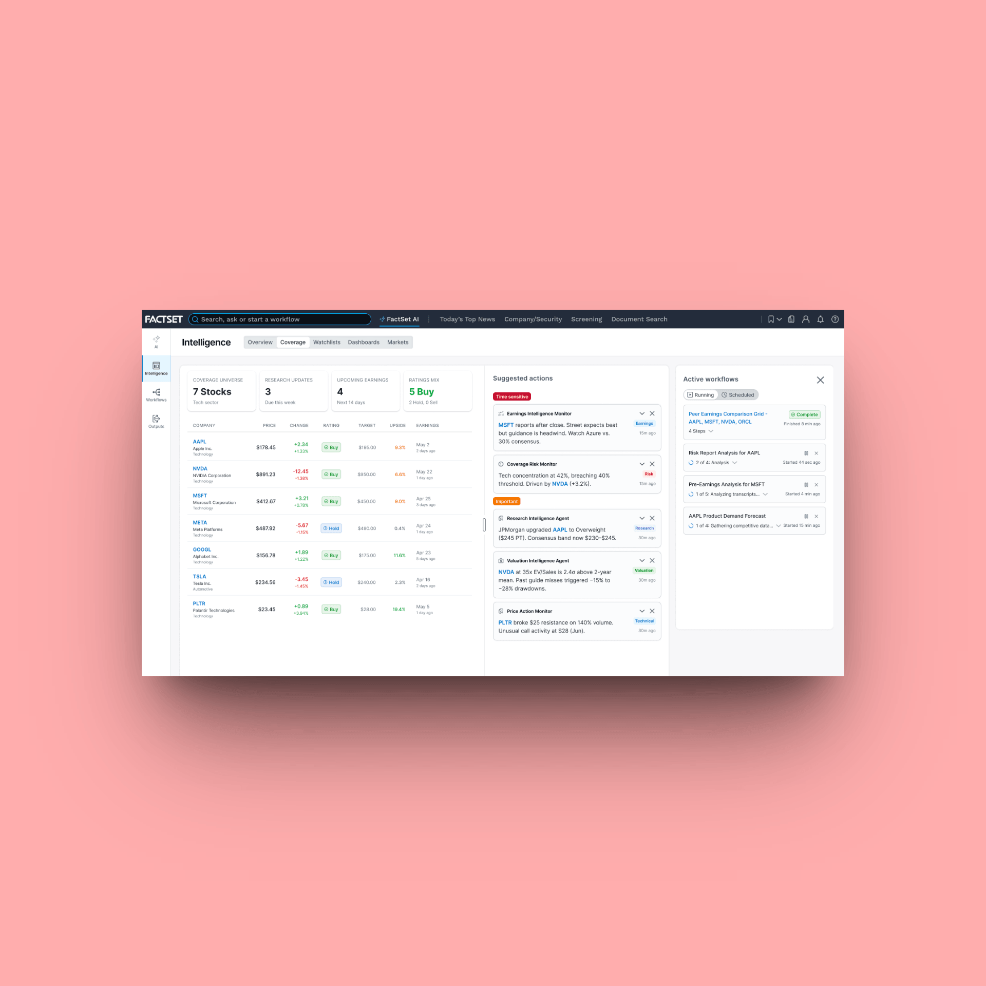
New monitor dashboard that surfaces relevant data as it happens, pulling from the user's watchlist and behavioral signals rather than requiring them to go look for it
Outcomes
NPS: 20 to 48. On an enterprise platform with 70,000 users, an NPS that moves 28 points is a great result. It ultimately means retention and renewal. It signals that the platform shifted from something users tolerated to something they valued. The move came from both ends of the scale: detractor share fell from roughly 25% to 12% while promoters grew. On an enterprise platform, detractors are churn risks with a renewal date. That falling number is the one the business cares about most.
Search utilization: +200%. One design decision, persistently advocated for, changed how tens of thousands of financial professionals interact with the most important discovery tool on the platform.
Help tickets: down 60%. A redesigned help system meant users could find answers independently. That is both a UX outcome and a direct operational cost reduction.
The tailored platform experiences for each user type and the agentic AI workflow layer are very much ongoing and in progress. Those outcomes are forward-dated, and not yet fully measured. But the strategic direction is set, the design thinking is documented, and the early indicators from the work already shipped point clearly in the right direction.
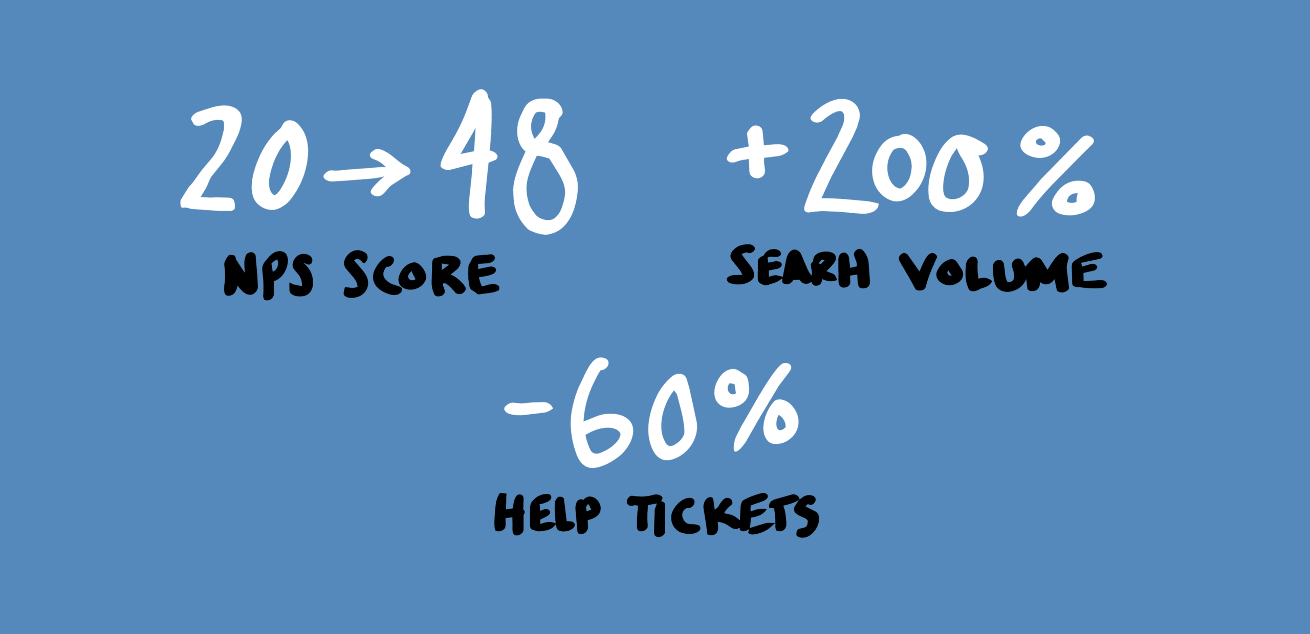
Yes, these metrics are real
Selected Works
FactSet Agentic PlatformProject type
FactSet MobileProject type
FactSet PlatformProject type
Maple Row Farm AppProject type
FactSet OnboardingProject type