FactSet Onboarding
From 78% dropoff to day-one delight
Role:
Principal Designer, Strategist
Timeline:
4 months
Team:
3 designers, 3 developers, 1 PM
Company:
FactSet
• Setup completion up from 22% to over 80% of new users
• Time to activation cut from days to minutes
• Onboarding support burden down 75%
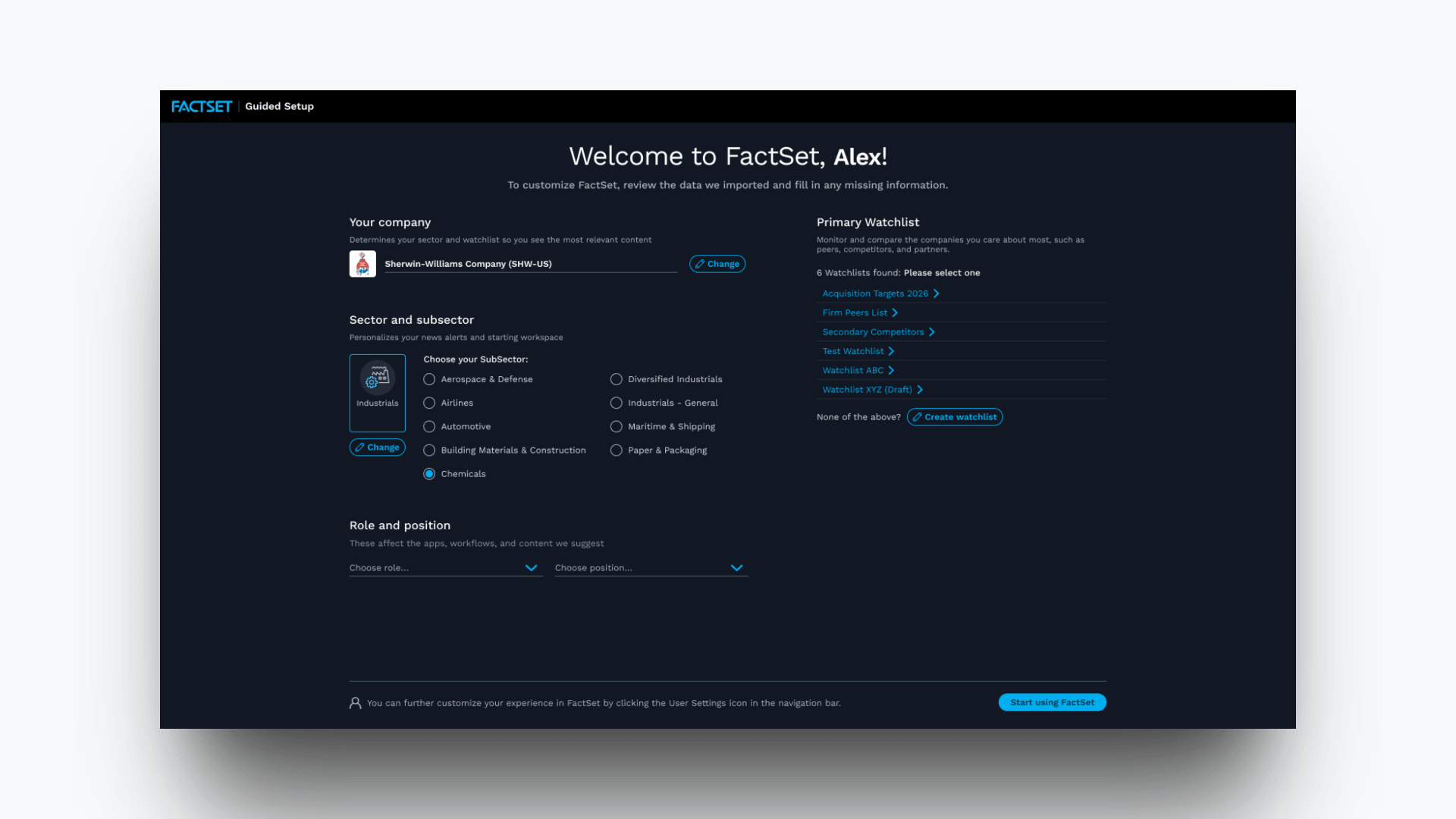
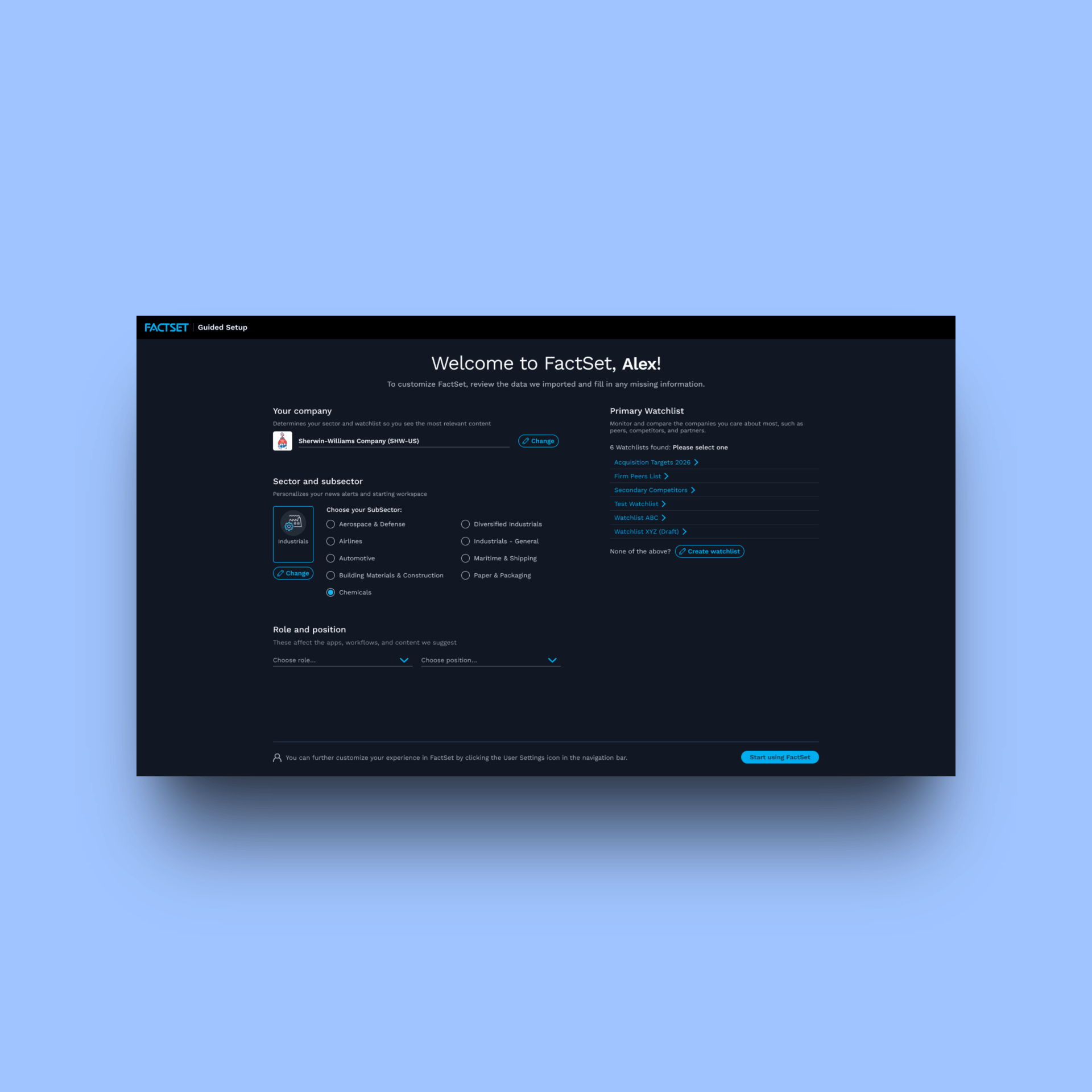
The redesigned onboarding screen, scoped to the user's role and firm before they touch a single input
Context
Let me just say that I get unreasonably excited about onboarding. Now that that's out of the way, I found out we had a big problem when usage data showed that 78% of new users never completed onboarding. They simply skipped it. At FactSet's price point, that was not simply a UX problem, it was a business problem.
FactSet serves wealth managers, analysts, portfolio managers, and traders at the largest financial firms globally. Many users are so loyal they carry their personal user ID from employer to employer when they change jobs. The expectation baked into that price and that behavior is simple: this tool should work, and it should work immediately. But the onboarding wasn't holding up its end of the bargain.
Without loading your watchlist or portfolio, core platform features were effectively non-functional. And shockingly, the recovery path was not self-service. It was human. FactSet's consulting team, hundreds of people worldwide, was responsible for visiting client offices to complete manually what the onboarding process should have handled. The average wait was days after a license activated. During that window, a brand-new user had a broken experience and no clear path to fixing it themselves.
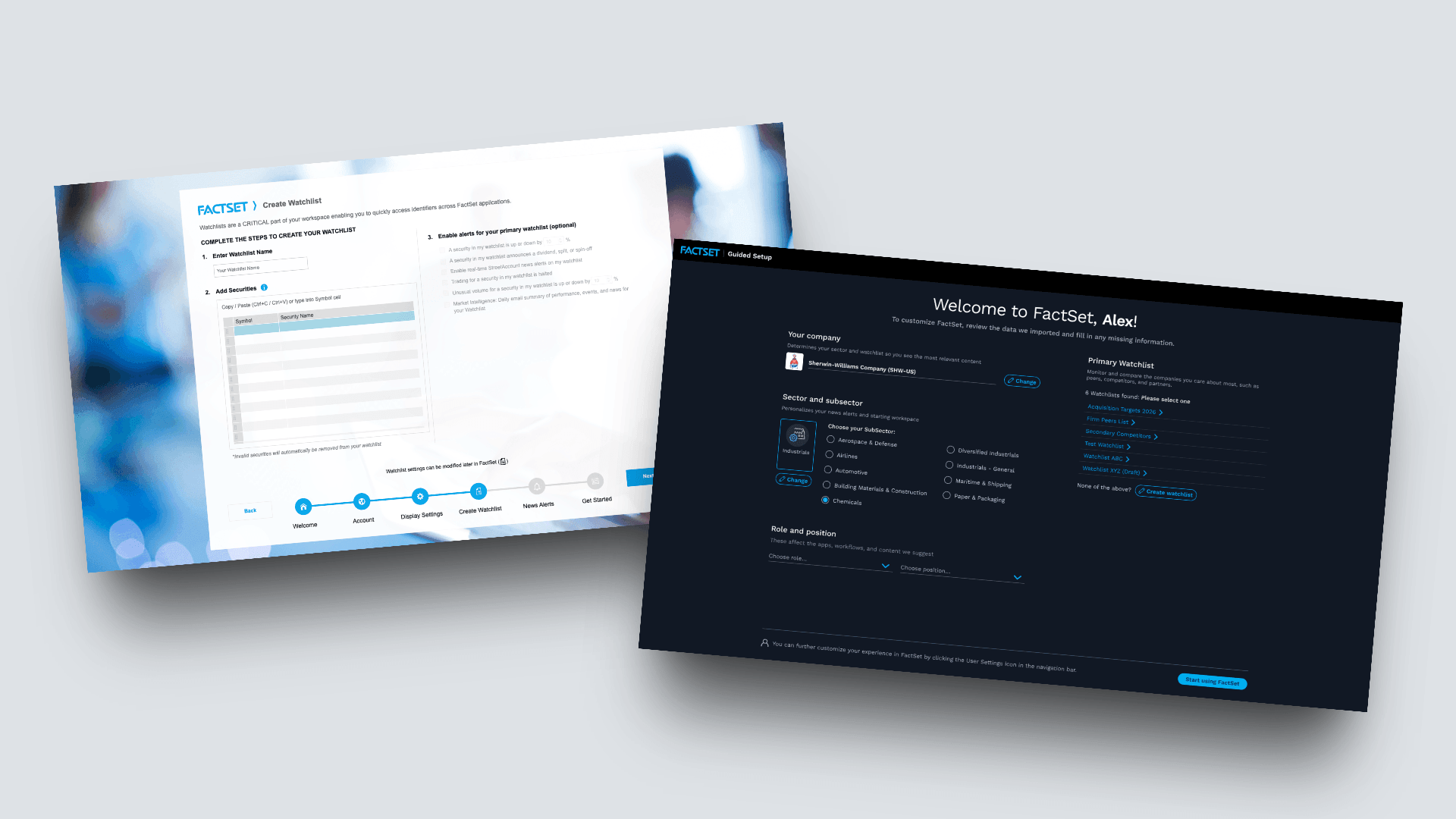
On the left, the onboarding users ignored and on the right, the one they didn't have to
Discovery
Discovery pulled from three directions: user sessions with financial professionals, helpdesk ticket analysis, and structured interviews with FactSet consultants. The data told the same story from every angle. Session recordings showed users exiting the onboarding modal within the first 30 seconds. Helpdesk tickets clustered around the same drop-off. Consultants described a similar pattern from hundreds of client visits. This wasn't a fringe problem hiding in edge cases. It was consistent, and it was costing us every time.
The issue wasn't motivation. It was a mismatch between user identity and the task being asked of them.
These are high-earning, time-pressured financial professionals who pay a premium for a professional-grade tool. Their mental model was simple: I pay, it works. The existing onboarding asked them to do the setup themselves, like a run-of-the-mill free consumer account. Doing this much lifting up front was simply beneath what they expected of the product.
The flow also looked worse than it actually was. The sheer number of visible steps signaled a large, undifferentiated lift before users could evaluate what even applied to them. So they closed it, skipping the entire process, and hoped it would get sorted out later. There were two big problems: an expectation mismatch and a perception problem that triggered avoidance before users even engaged.
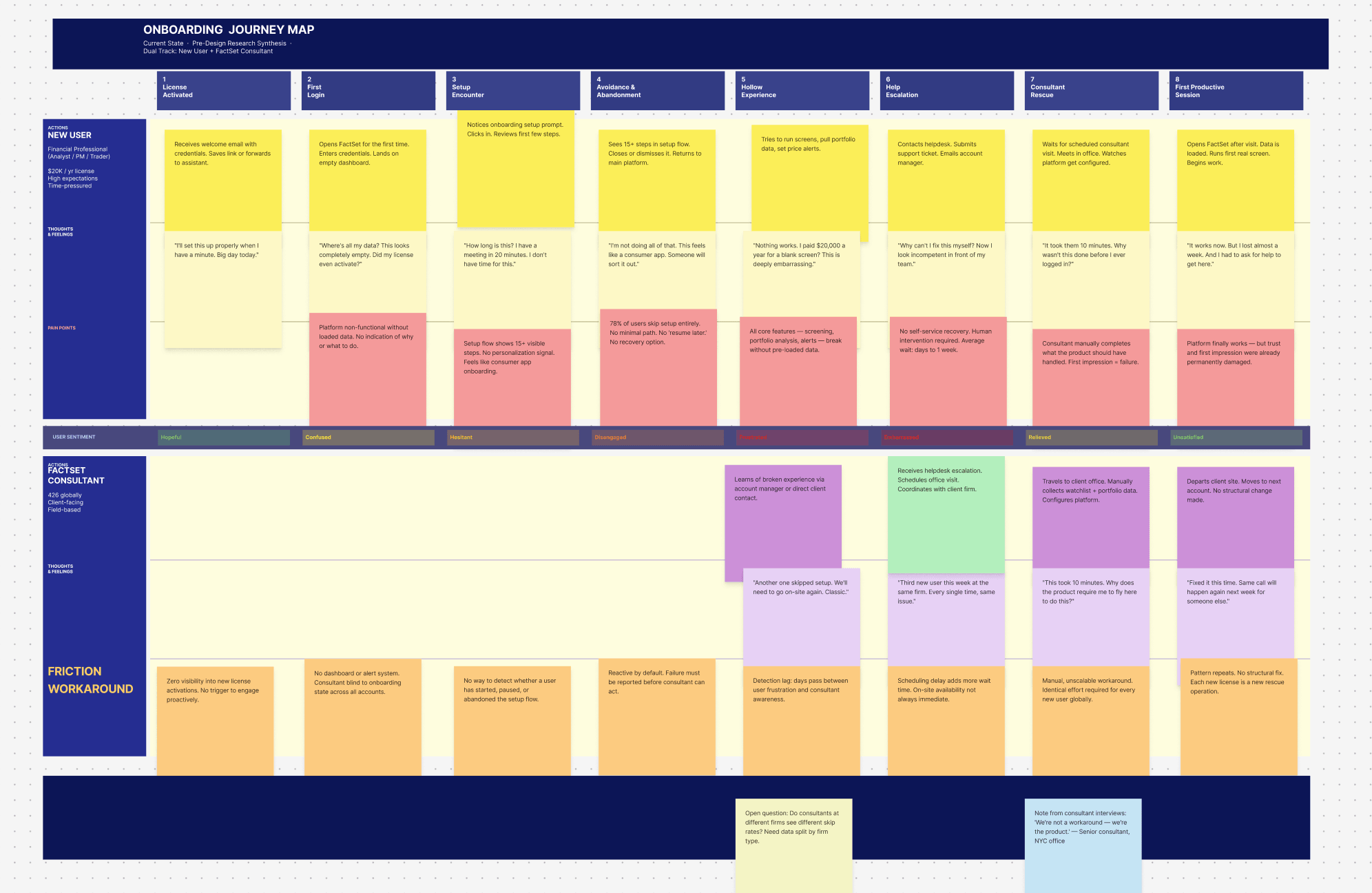
Every gap in this onboarding journey map is a user who closed the modal and waited days for a consultant to fix it
Strategy
I pivoted the approach. It was fruitless to convince high-expectation users to complete the setup themselves, so instead I met them at their mental model. They expected the platform to be ready for them. So we made it ready for them. We just shifted who did the work, and when.
I cut the flow from nine steps to four, all neatly laid out on one screen. The removed steps were ones users either skipped or completed incorrectly: manual data source connections, notification preferences, a tutorial module nobody watched. What remained was scoped to the user's role and firm from the moment the screen loaded. A wealth manager saw a wealth manager's setup. A trader saw a trader's. The onus was visibly smaller because it actually was. Median setup time in testing came in under three minutes, for a flow users had previously abandoned inside the first 30 seconds. The personalization is visible right out of the gate. It felt like the product was working for them, not requiring them to do any heavy-lifting.
For consultants, I designed a back-end tool that lets them pre-load a client's watchlist, which changed how they initiated a new user relationship. Instead of arriving after a broken experience to fix what had already been skipped, consultants now led with collection. Their first client conversation became a data handoff, not a rescue mission. Now when a new user opens FactSet for the first time, their data is already there. The platform worked from the very first minute, the way expensive software should.
This was not just a UX improvement. It was a role transformation. Consultants moved from reactive rescue to proactive setup partners, and clients received a better experience immediately.
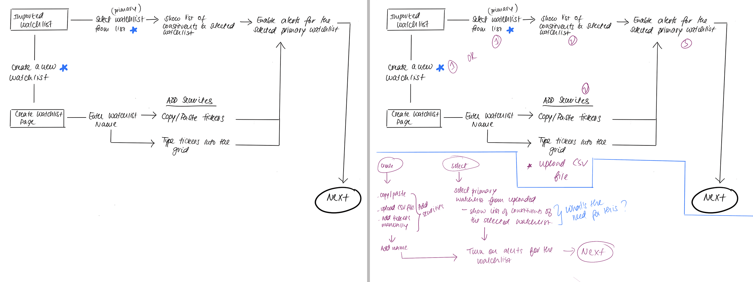
Watchlist upload/creation flow. Legacy vs improved, abridged flows
Execution
Both tracks had to work in unison. Users would see the redesigned onboarding screen, clearly configured for this specific user. On the consultant side, the pre-load tool gave the client-facing team a structured, streamlined process for collecting user data before activation.
Both were built with direct input from the people closest to the problem: the consultants who had lived the failure, and the users whose expectations had never been met.
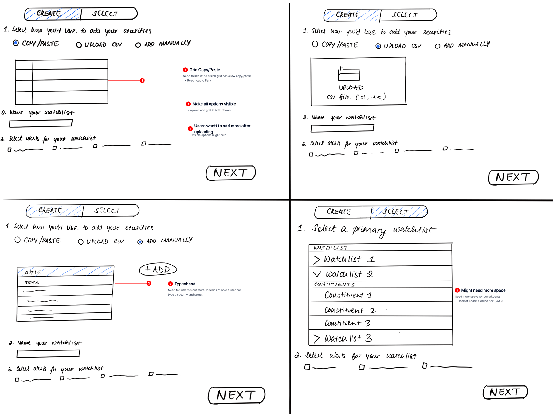
An early direction put the full upload flow on the user upfront. User testing killed it fast. The cognitive lift before any value was visible was exactly what triggered avoidance
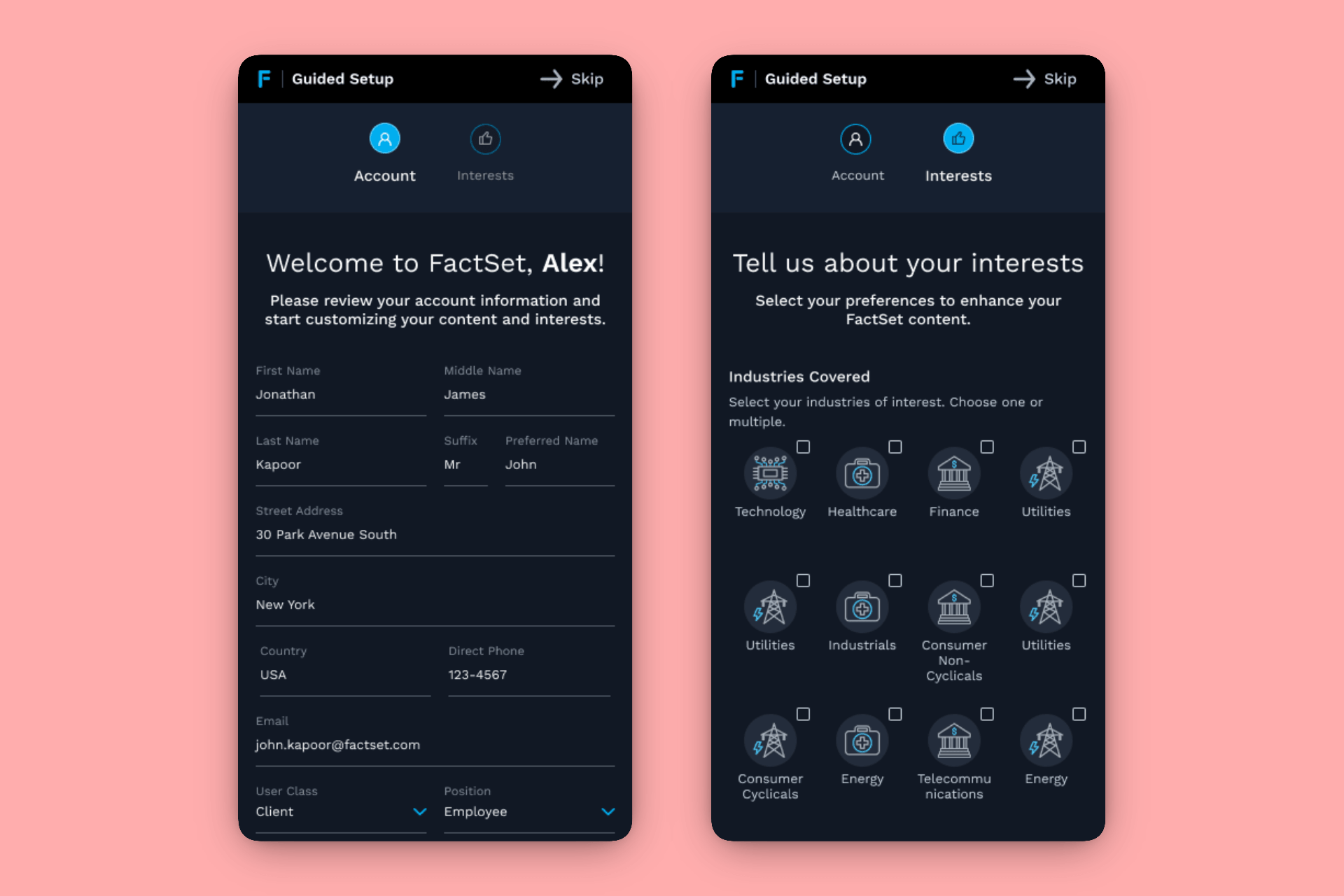
Because these users don't only sit at desks
Outcomes
The onboarding skip rate fell from 78% to under 19%, a drop of roughly 75%, and the support burden fell with it. Time-to-activation, the window between license start and a fully functional platform experience, dropped from days to minutes. Qualitative feedback from consultants consistently described the shift as "night and day," and first-session satisfaction came up in client check-ins in ways it never had before. People who finished the new flow reached their first real task, checking a watchlist or running a company lookup, in their first session instead of days later.
Onboarding at FactSet went from something users widely avoided to something consistently described as a pleasure. For a platform serving demanding, high-expectation financial professionals at the world's largest firms, that is no small task.
The deeper outcome was structural. By redesigning who did the work and when, we changed the operational model for how FactSet brought new users onto the platform, at scale, globally.
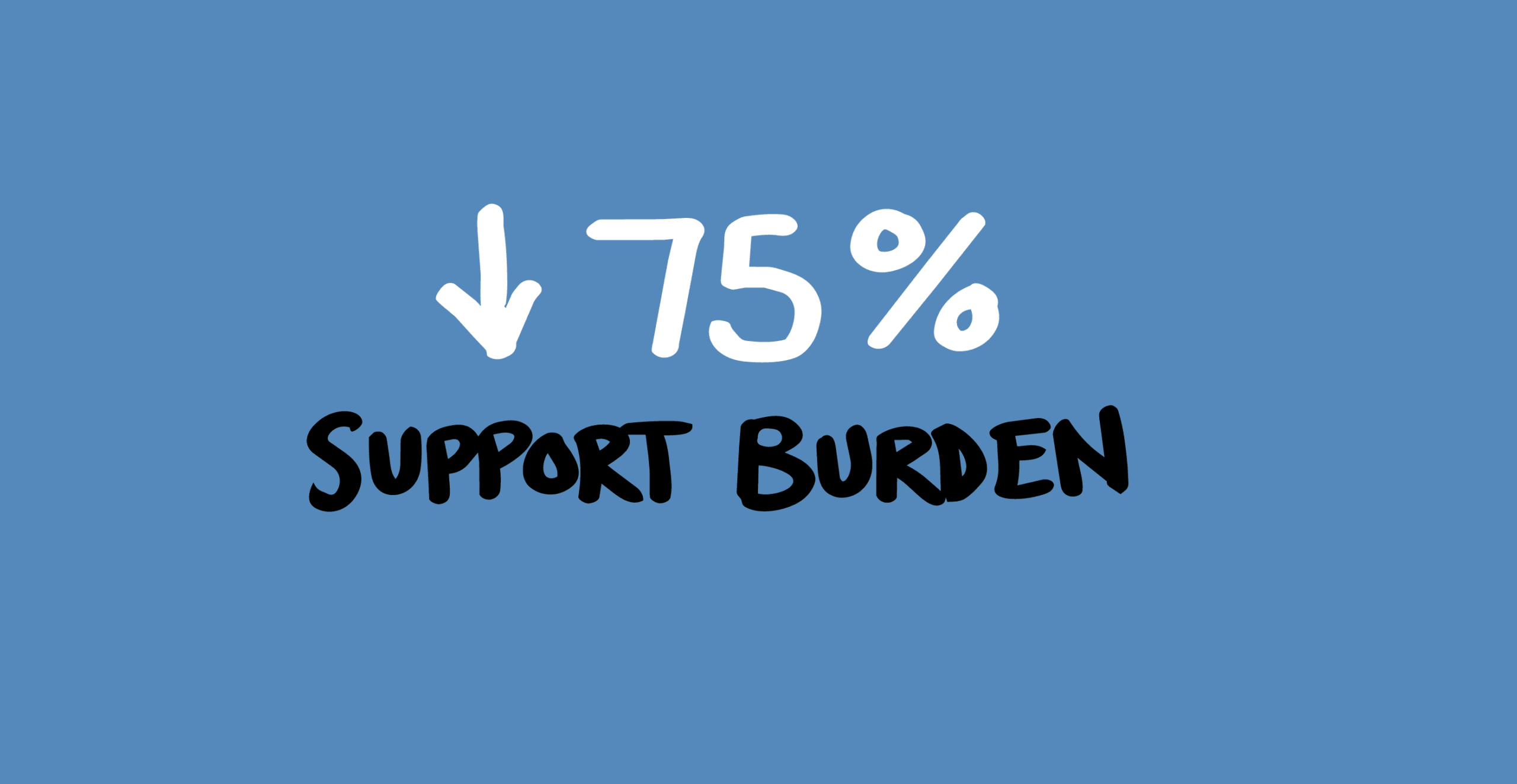
Decreased support burden by 75%, and still falling
Selected Works
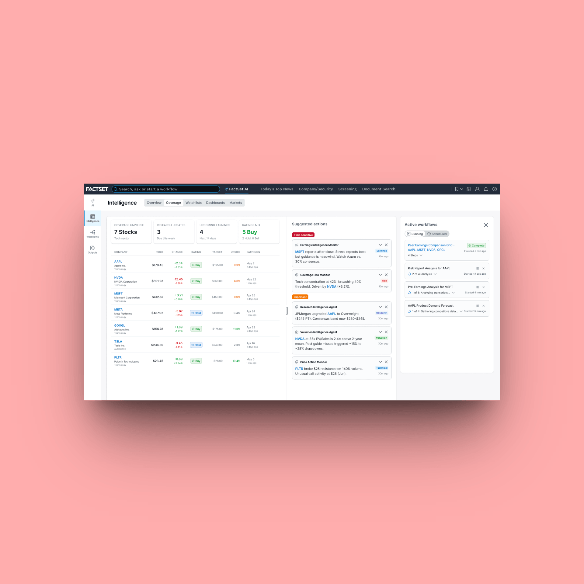
FactSet Agentic PlatformProject type
FactSet MobileProject type
FactSet PlatformProject type
Maple Row Farm AppProject type
FactSet OnboardingProject type