FactSet Mobile
The app most users ignored was the only FactSet 1,000 customers ever saw
Role:
Design Lead, Strategist
Timeline:
12 months
Team:
3 designers, 3 developers, 1 PM
Company:
FactSet
• Home tab visitors up 52%, from the #3 tab to #1
• Daily stickiness up six points post-launch, from 17.7% to 23.9%
• NPS doubled, 8 to 18
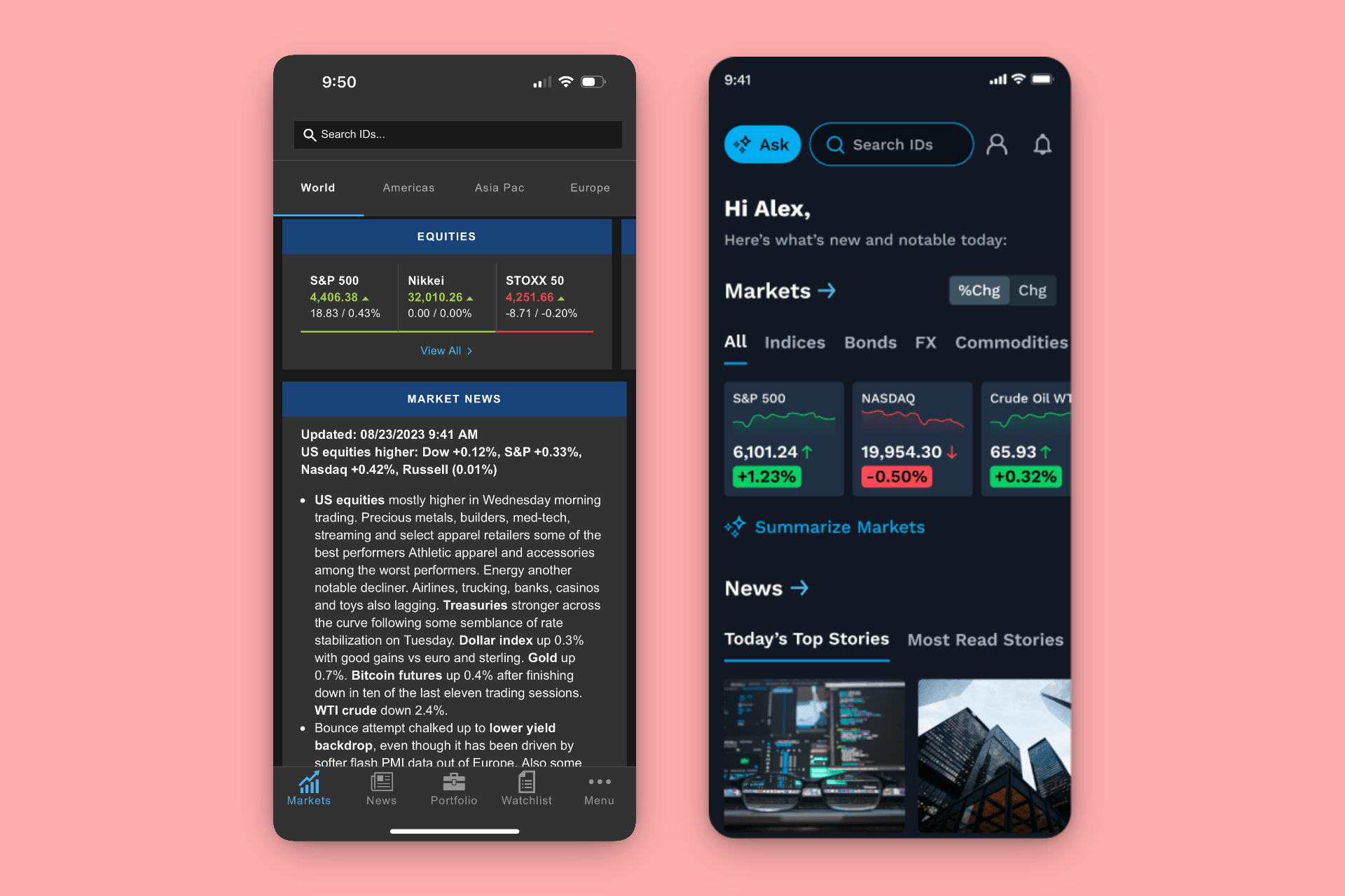
Left: the legacy app that came free with a five-figure subscription and felt like it. Right: the reason people are actually opening it now
Context
FactSet serves over 200,000 investment professionals. The desktop workstation is the flagship product: powerful and deeply trusted. The mobile app came bundled at no extra cost with a premium subscription.
Most users had the mobile app only because it came with the platform, and they rarely opened it. The app was visually outdated, generic, built without a specific user in mind, and had no relationship to the desktop product. For a brand built on precision and trust, mobile was quietly undermining both.
And for roughly 1,000 customers, representing about $20M in annual revenue, the stakes were higher than brand. Mobile wasn't their companion app. It was the only FactSet they used. They never opened the desktop platform at all. Our weakest experience was their entire experience.
Constraints
The team was small, only 3 designers, 3 developers, and 1 PM, working against years of neglect and an outdated backend that constrained a lot of what was possible. Initially, the executive team didn't believe mobile was worth pursuing, so organizational buy-in was as much of a design challenge as the product itself. Mobile was considered a dead-end product at FactSet.
Discovery
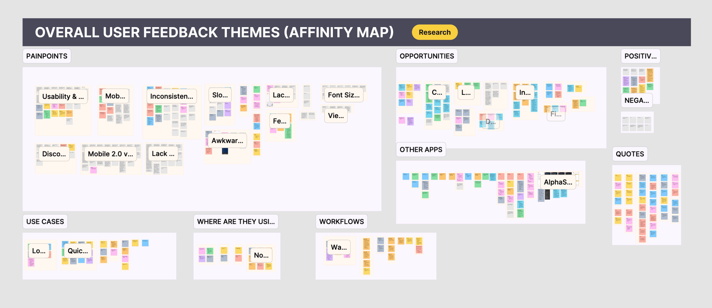
This map surfaced the two jobs-to-be-done that became the strategic foundation for the redesign and also helped us consciously set aside the features that weren't worth chasing
Wealth managers made up over 60% of the user base. Their behavior was very consistent: log in once a day, check what they need, and move on. Mobile wasn't considered a deep-work tool. It was a quick-check, barely daily habit.
The more important finding was that users were consistently reaching for Bloomberg, LSEG, Yahoo Finance, and Google Finance first. Those apps were winning on clarity, simplicity, and scannability. FactSet had no compelling answers on those terms.
But FactSet was the only choice for two specific jobs: monitoring watchlists and portfolios, and deep company lookup, surfacing proprietary data points that the lighter apps couldn't provide. Users kept the FactSet app for exactly that, and nothing else.
Strategy
The strategic decision was deliberate. I mapped everything the app could theoretically do and tested appetite for all of it. Users were politely indifferent to most of it. The research kept collapsing back to two jobs: monitoring portfolios/watchlists and running deep company lookups. Everything else was a feature Bloomberg already did better, so for phase 1 we temporarily stopped trying to win that fight. Making two experiences genuinely great felt more valuable than shipping six mediocre ones.
The home screen was the centerpiece. If a wealth manager opens the app once a day for 90 seconds, the first thing they see has to immediately tell them whether anything demands their attention. A generic feed wouldn't do that. A personalized dashboard built around their portfolio would.
I rebuilt the IA from scratch. The old structure was organized around internal data teams, not how users thought about their work. The new architecture had four primary tabs: Home, Watchlists, Portfolio, and Search, each with a clear backend owner so teams could ship independently without blocking each other. Simple on the surface, but getting four data teams to agree on deliverables was its own negotiation. The centerpiece bet paid off in the data. Before the redesign, Home ranked less than #3 in its own tab: people were routing around the front door. Within a quarter of launch it was #1.
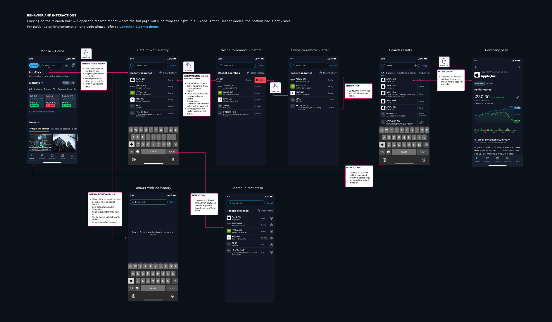
These flows went through four rounds of testing before I locked them. The first version had three extra taps to get to a company's key data
Execution
Research was the first step, studying how users navigated through the existing app, how they used competitor apps, and where behavior and stated preferences diverged. Journey maps helped identify exactly where the experience broke down and where there was latent value worth protecting.
From there we ran an iterative build cycle, section by section. Early on, we planned a personalized news feed for the home screen. Testing showed users mostly ignored it because they already used Bloomberg for that. Parking it felt bad for about a day, then the screen got cleaner and the path to their data got shorter. A lot of high-value components ended up on the back burner. With a team this size, doing one thing well always beats doing three things halfway.
Navigation placement turned out to be one of the highest-leverage calls in the whole redesign. One high-value feature had been buried in a secondary menu, and the usage data showed it. When I elevated it to the global header, unique visitors grew 54%, account adoption nearly doubled from 3.2% to 5.9%, and first-time accounts discovering the feature grew 77%. It is a niche feature measured in hundreds of users, not thousands, which is exactly why the pattern matters: when every percentage moves that hard on a small base, the constraint was placement, not demand. No feature work, just placement.
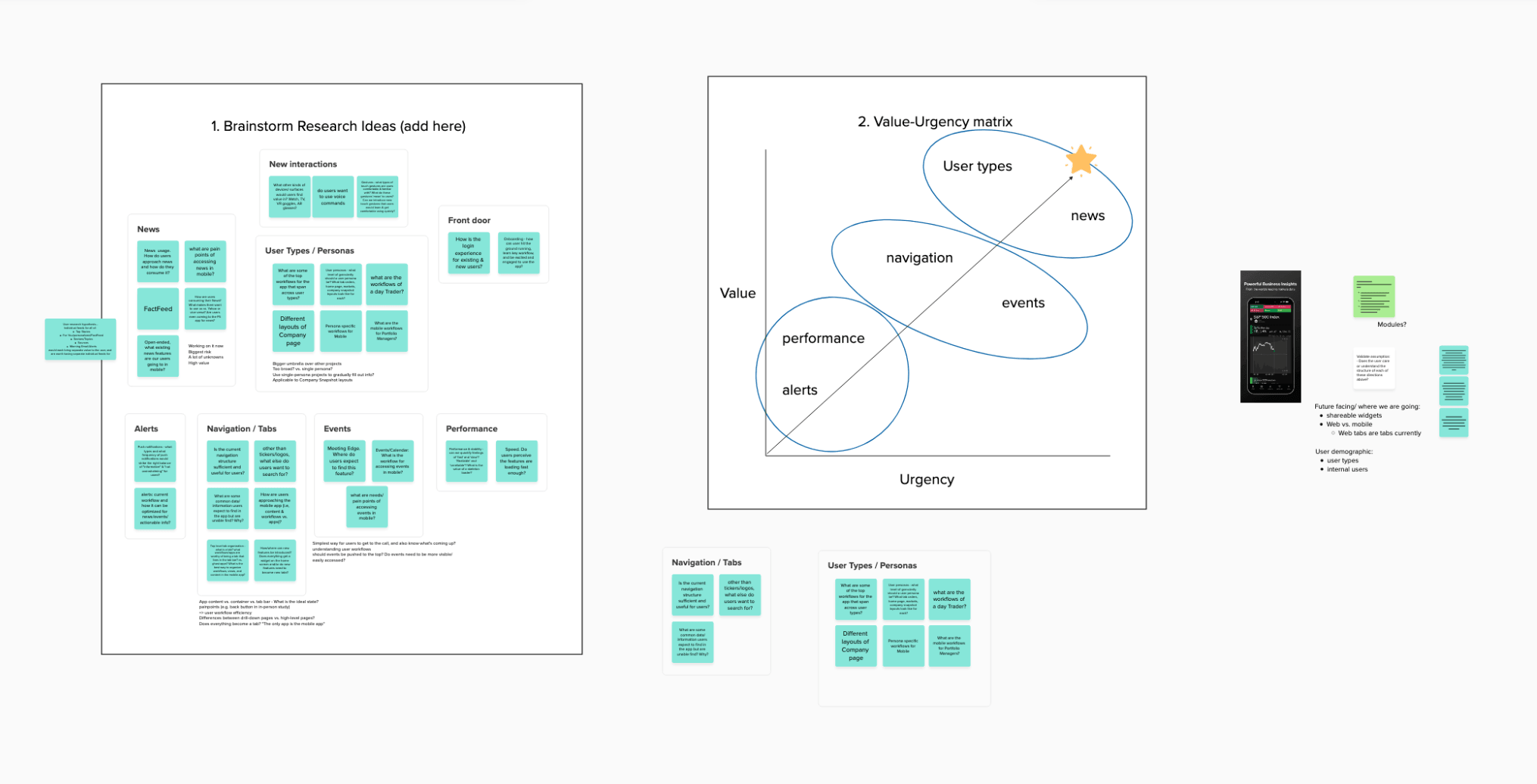
We used this matrix to sequence the phase 2 build. Anything high urgency and high value got designed first; everything else got temporarily put on hold
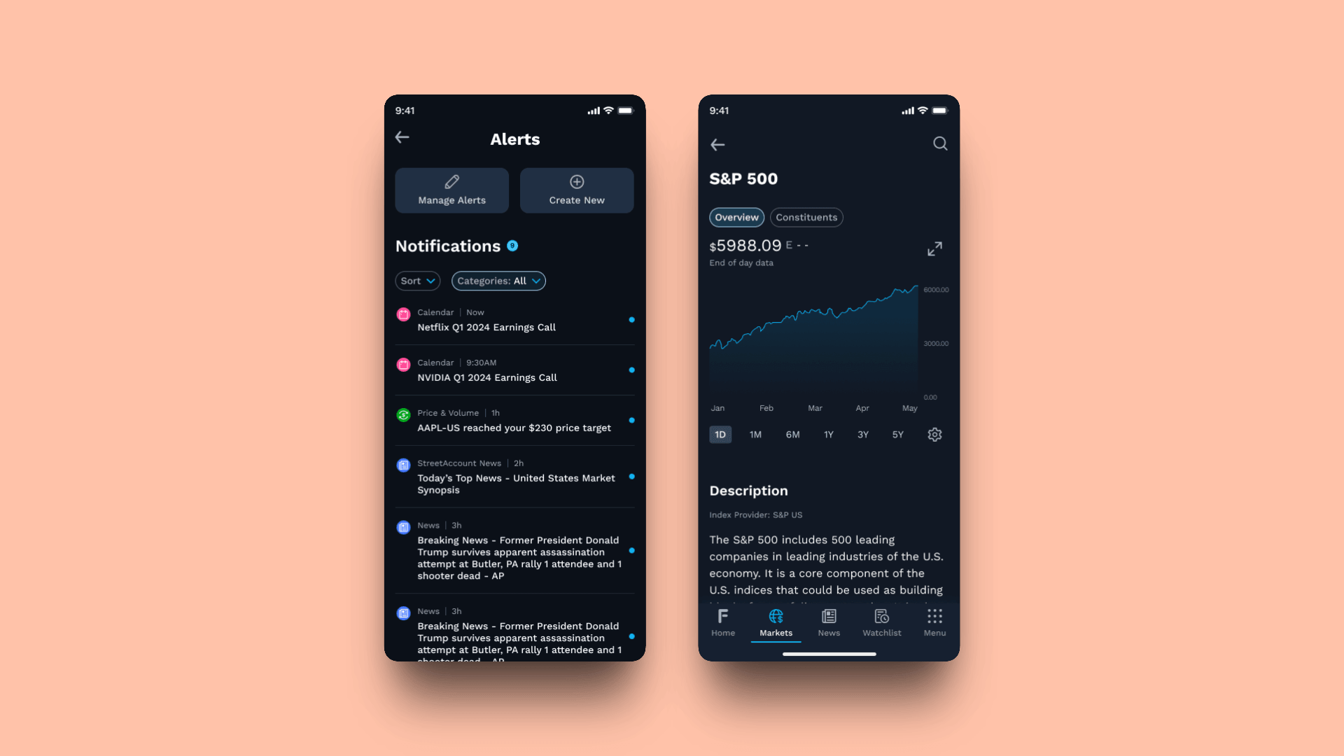
Alerts surface what needs attention and the company quote view delivers the proprietary depth that keeps users from reaching for the competition
The CEO Transition
Midway through the project, the CEO, who had become our mobile champion, stepped down. Suddenly the organizational cover that had kept us resourced and prioritized disappeared overnight.
Rather than waiting to see what the new CEO would inherit as priorities, I scrambled to get time with him during his onboarding and walked him through the research, the strategic rationale, and the work in progress. That conversation turned an inherited priority into a personal conviction and support continued uninterrupted through the transition.
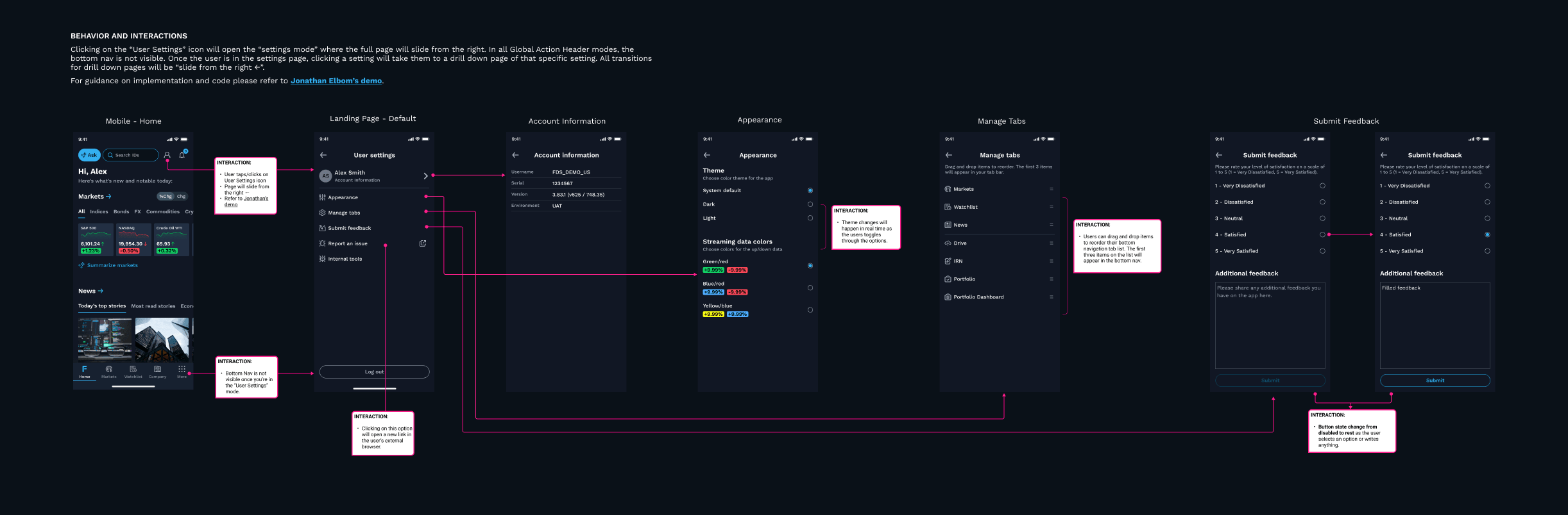
Personalization was what made the home screen work. These settings let users tune the experience to their specific portfolio/watchlist because a dashboard built for everyone is really built for no one
Live view of FactSet Mobile, showcasing the home screen and the company detail screen.
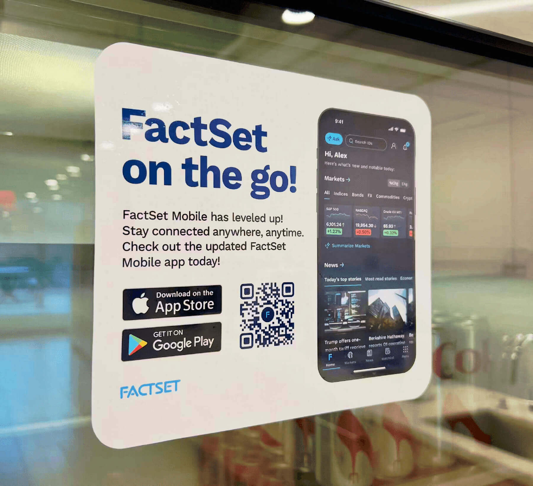
The launch got a proper rollout, including these cute window clings, posted in client offices around the world. After all that work, we earned a little swagger.
Outcomes
The redesign launched first to 5,000 early adopters, then scaled to 70,000 across four of the six identified user types, with the expansion ongoing.
The results:
- Wealth managers, over 60% of the user base, tripled their daily sessions, from one login a day to 3+
- NPS more than doubled, from 8 to 18, off a critically low baseline, signaling a genuine reversal in user perception
- Company lookup usage up 35%, within six months of the redesigned section launching
- The 1,000-customer mobile-only cohort, whose entire FactSet experience is this app, went from tolerating our weakest product to running their day on it
Post-launch behavioral data, measured in Pendo against the pre-launch quarter, backed early signals:
- Home app quarterly unique visitors grew from 12.6K to 19.1K (+52%) and the app moved from #3 to #1 most-used on Mobile, passing the two apps that had held the top spots for years
- Markets app quarterly unique visitors grew from 7,718 to 12.2K (+58%)
- Weekly active users broke out of a long-flat 7,500 to 8,000 band to roughly 9,500
- Home module header interactions entered the top ten most-used features for the first time, at 22K events. Users were working the new module structure, not passively scrolling
The question with any redesign is whether the launch spike holds and six months out, it had. Home grew another 10.5% to 21.1K quarterly unique visitors and held the #1 spot. Daily stickiness climbed from 17.7% before launch to 18.3%, then to 23.9% by summer, and it kept climbing through a seasonal summer dip in weekly traffic. That is the pattern you want: the daily habit deepened while casual usage thinned. The redesigned navigation carries most of the activity in the app: nav bar taps (665K) and Home link taps (219K) rank among the top mobile features. This is a durable change in how people use the app, not a launch-quarter bump.
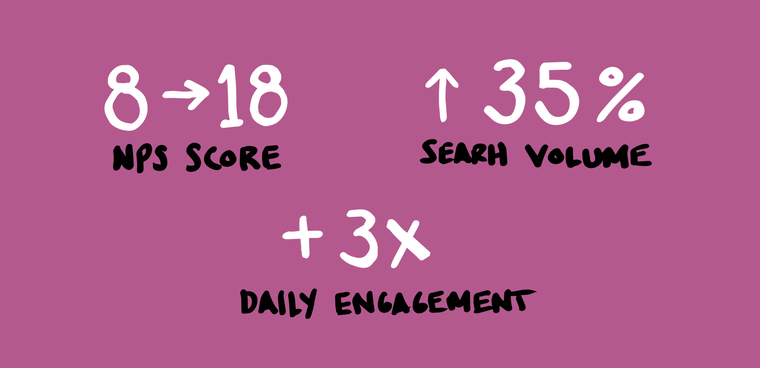
NPS doubled, off a critically low baseline. The initial cohort was 1,000 users, so we treated this as a strong directional signal rather than a statistically definitive result but the trend continued as rollout expanded to 70,000
Selected Works
FactSet Agentic PlatformProject type
FactSet MobileProject type
FactSet PlatformProject type
Maple Row Farm AppProject type
FactSet OnboardingProject type